Dashboards in Pricefx let you bring together the data you care about into a single view. For example:
-
A salesperson might track open quotes, regional price lists, and workflow approvals in one dashboard.
-
A customer manager might monitor progress for a specific client or group of clients.
Dashboards are an easy way for you to bring your data together in a more manageable way. You can create a personal view to track things like open quotes, applicable price lists for your region, and workflow approvals in a single place, or prepare regular reports for a customer or group of customers and track their progress over time.
This guide walks you through creating a new dashboard and customizing its content and layout. For a full technical reference of all dashboard settings and options, see How to Create a Dashboard.
Before You Start
A bit of preparation makes it easier for other users to find and understand your dashboard.
-
Check existing dashboards and how they are organized
-
Open Dashboards from the main menu.
-
Look at how dashboards are named and grouped in your environment (for example, labels starting with patterns like
A. Sales Insights,H. Quote, etc.). -
Follow the same style so your new dashboard feels consistent.
-
-
Follow your team’s naming/numbering conventions
-
Many projects use a letter + number pattern like
A.01,A.02, etc. -
When adding a new dashboard, continue that sequence. For example, if the last dashboard is A.09, name the next one A.10.
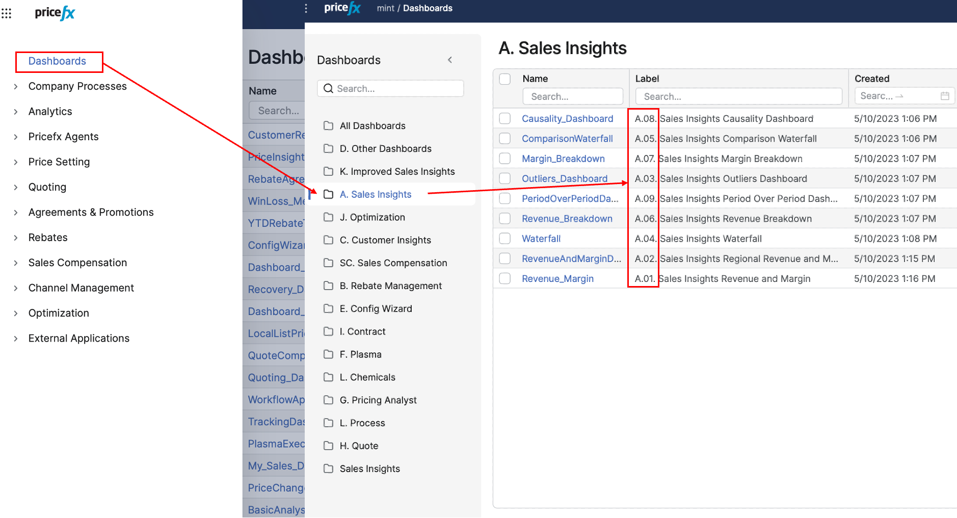
Naming and numbering conventions in Dashboards
-
-
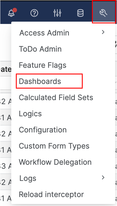
Know where you create dashboards
-
You will create and manage dashboards in Administration > Dashboards.
-
Step 1: Add a New Dashboard
First, create the dashboard shell and basic settings.
-
In the main menu, go to Administration > Dashboards.
-
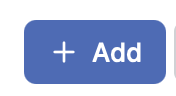
In the Dashboards administration screen, click Add (in the top‑right corner
-
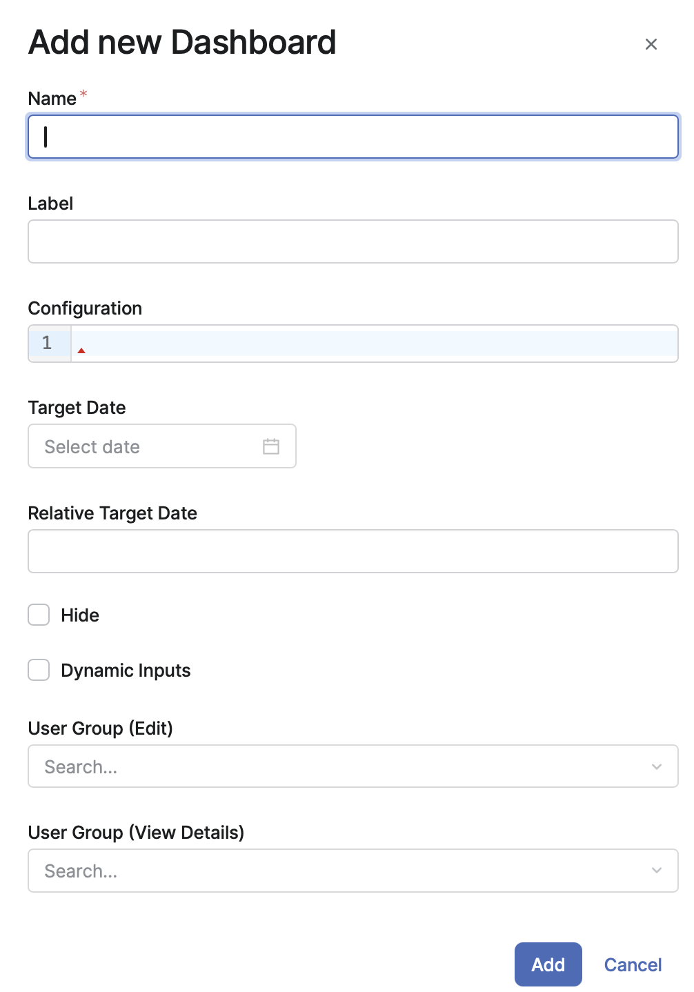
In the Dashboard Settings screen, fill in these fields:
-
Name
-
Technical name of the dashboard.
-
Must be one string with no spaces, for example:
1j_My_Sales_Dashboard.
-
-
Label
-
Friendly name users see in menus, for example:
1j My Sales Dashboard. -
You can include any prefixes your team uses for grouping (for example,
A.01,H.03, etc.). This is now the main way to visually group dashboards after category removal.
-
-
JSON Configuration (optional, advanced)
-
Lets you define advanced behavior, such as which action buttons are visible on the dashboard.
-
-
Target Date / Relative Target Date (optional)
-
Lets you set either a fixed date or a date relative to today (for example, “today + 30 days”).
-
-
Hide (optional)
-
If enabled, the dashboard does not appear in the Dashboards drop‑down or in the My Dashboards portlet on the Home page.
-
-
Dynamic Inputs (optional, powerful feature)
-
When enabled, the dashboard logic runs twice:
-
First pass: determine input values (for example, default customer, date range, etc.).
-
Second pass: calculate the real results using those inputs.
-
-
Typical use cases: pre‑fill inputs based on current user, current date, or other context.
-
Important behavior when this is enabled:
-
Inputs predefined in the Configure Dashboard dialog are not applied.
-
A later refresh of the dashboard does not regenerate inputs; this is not a fully dynamic configurator.
-
The logic must be written so that the input‑determination run is quick and lightweight and aborts once it has generated the inputs.
-
-
-
User Group / User Group Access (optional)
-
Controls who can view or edit the dashboard.
-
Enter a user group according to your organization’s access model. If you are unsure which group to use, ask your system administrator.
-
-
-
Click Add to create the new (blank) dashboard.
Your dashboard now exists, but still needs logic and content.
Step 2: Attach Logic and Configure Inputs
Each dashboard is powered by a calculation logic prepared to deliver its data and structure. The logic can define:
-
Portlets – individual blocks on the dashboard (charts, result matrices, or even custom HTML).
-
Filters and global parameters – inputs that control what the dashboard shows.
-
Additional behavior for how the dashboard behaves and refreshes.
To connect logic to your new dashboard:
-
Stay in Administration > Dashboards, find your dashboard in the list, and click Configure.
-
In the configuration dialog, choose the appropriate Logic from the dropdown. For example, you might select a logic called Customer Insights – Customer Detail Logic if your dashboard is focused on customer analysis.
-
Set the input parameters shown in the dialog. These come from the logic and typically represent filters (for example, customer, time period, region, or other business dimensions).
-
If the logic uses cascading filters, you can enable Cascade Filter Inputs:
-
When enabled, dependent filters appear only after a value is selected in the master filter.
-
When disabled, all filters are shown at once, but selecting a value in one filter still limits the possible values in the others.
-
-
(Advanced) The logic can use
DashboardControllerto generate portlets with custom HTML content (for example, a portlet that alternates between a chart and an HTML explanation). -
Click Save to apply the logic and parameter settings to the dashboard.
At this point, the dashboard “knows” what data and portlets it should contain. Next, you arrange and fine‑tune the layout.
Step 3: Customize the Dashboard Layout
Now you organize how everything looks and behaves to your users.
-
Open the Dashboards menu and click the name of your new dashboard to open it.
-
On the dashboard screen, you can:
-
Rearrange portlets
-
Drag and drop portlets to change their position within or between columns.
-
-
Resize portlets
-
Use resize handles (where available) to make portlets wider, narrower, taller, or shorter.
-
-
Add portlets
-
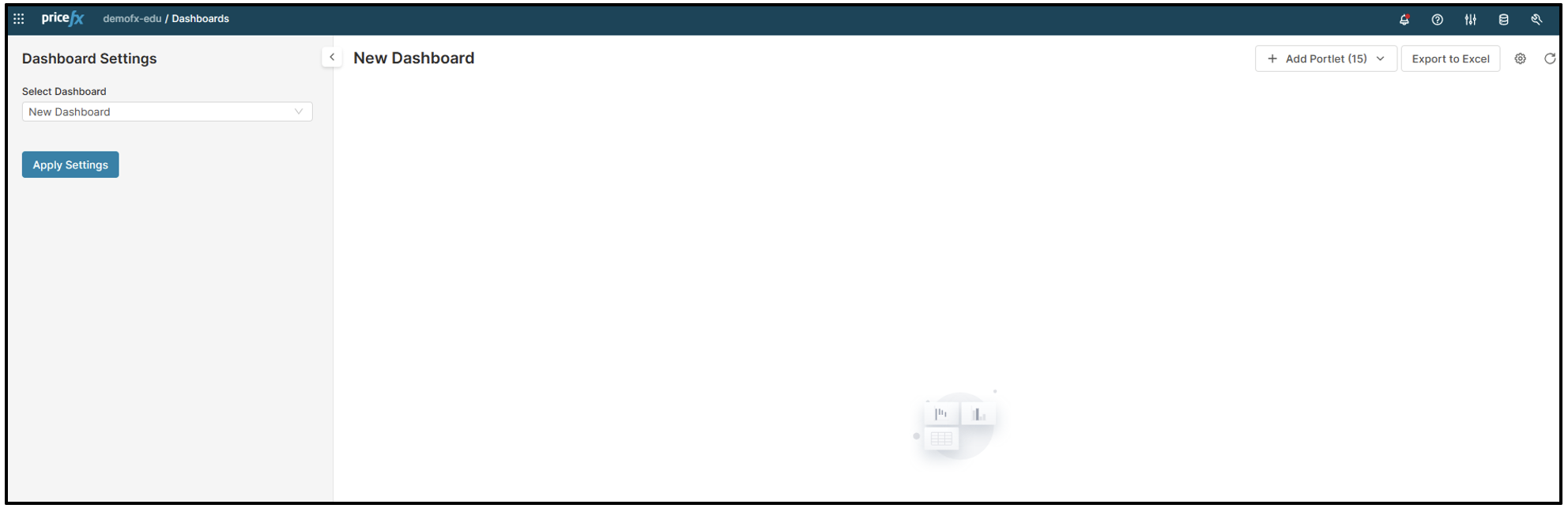
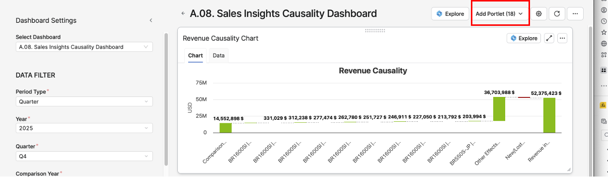
Click Add Portlet (top‑right).
-
Choose from the list of default and custom portlets (widgets), such as My Charts or My Dashboards.
-
The new portlet is added at the top of the first column; you can drag it to any position you like.
-
-
Hide/remove portlets
-
Open the portlet’s context menu and select Hide.
-
The portlet disappears from the layout but stays available in the Add Portlet menu if you want it back later.
-
-
Save or delete the current view
-
Save the current layout as a private or global preference, depending on your permissions and how widely the layout should be shared.
-
-
Export to Excel
-
Use Export to Excel to export raw data from the dashboard. You can choose which portlets to include.
-
When a matrix has a defined format, these formatting elements are preserved:
-
Bold/normal font
-
Font color (hex values)
-
Background fill color
-
Data typing (numeric, percentage)
-
-
There is a limit of 64,000 formatted cells; once this is exceeded, remaining cells are exported without formatting.
-
-
Reset to default
-
Use the reset option to return the dashboard to its default version if you want to discard layout changes.
-
-
With these tools, you can quickly iterate on your dashboard layout until it matches how you and your users want to work.
Add Content to Your Dashboard
Add Portlets
-
Go back to your Dashboard Menu.
-
Open your new dashboard (refresh if it does not appear).
-
Click Add Portlets (top-right).
-
Select from the available portlets (e.g., My Charts, My Dashboards).
-
Resize, move, or configure them as needed.
-
Save your changes.
Add Charts
Follow the instructions in the Add Charts to Dashboards article.
See Also
-
How to create a Dashboard - video tutorial and explanation
-
Create Logic for Blank Dashboard - step-by-step process to add a logic for dashboards
-
Portlets - description and examples
-
Add Charts to Dashboards - step-by-step process to add charts to dashboards