In Analytics you can get visibility into prices and margins or customer behavior. It gives you the ability to forecast trends or understand and improve business performance.
With the provision of transactional data to the calculation and simulation of product prices and margins, Analytics supports the definition and execution of the pricing strategy. In reverse direction it allows the analysis of actual and simulated pricing methods supporting the modeling of the enterprise performance and profitability. Analytics also provides an easy and tight (meta level) integration with MS-Excel.
Analytics keeps track of historical data, so that out-dated or phased out products or inactive customers still contribute in reporting (while in Price Setting you want to have only currently offered products or active customers).
Data Sources and Data Flow
Pricefx structures analytics data through a clear flow:
-
Data Feeds: Raw input (e.g., transactions, competitor prices).
-
Data Loads: Cleansing/enrichment processes to prepare data.
-
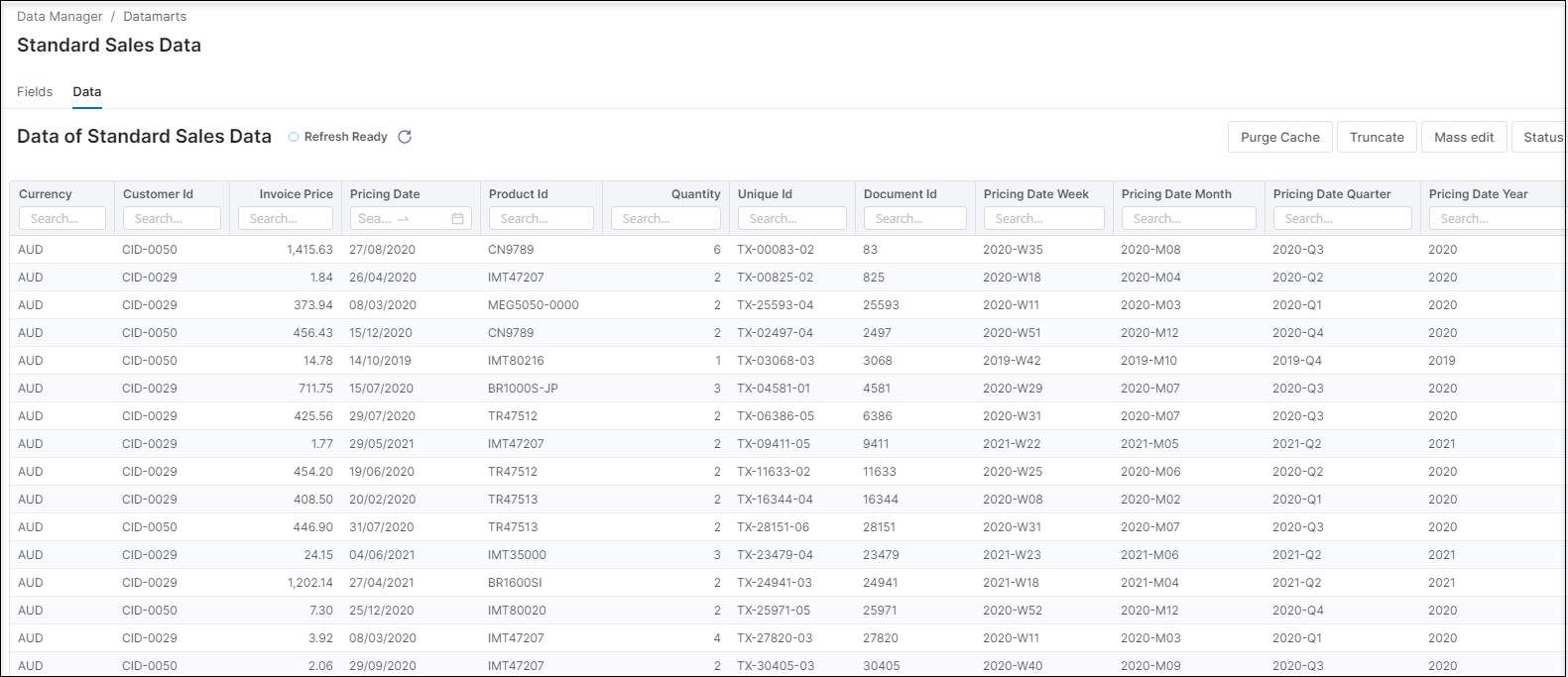
Data Sources: Structured repositories of cleansed data, organized by type (customers, products, transactions).
-
Datamarts: Consolidated collections from multiple sources for advanced analytics.
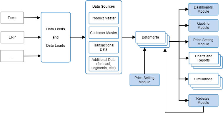
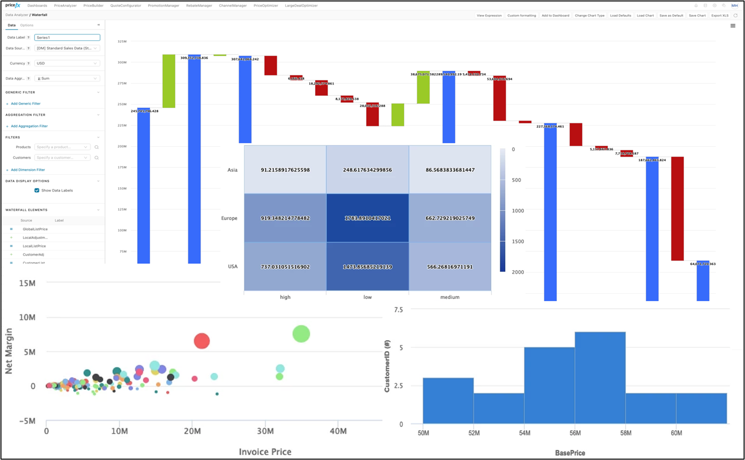
Chart Types
Pricefx Analytics supports a wide selection of chart types:
-
Bar & Line → Compare two related values (e.g., Gross Margin vs. Base Price).
-
Box Plot → Visualize data distribution and outliers.
-
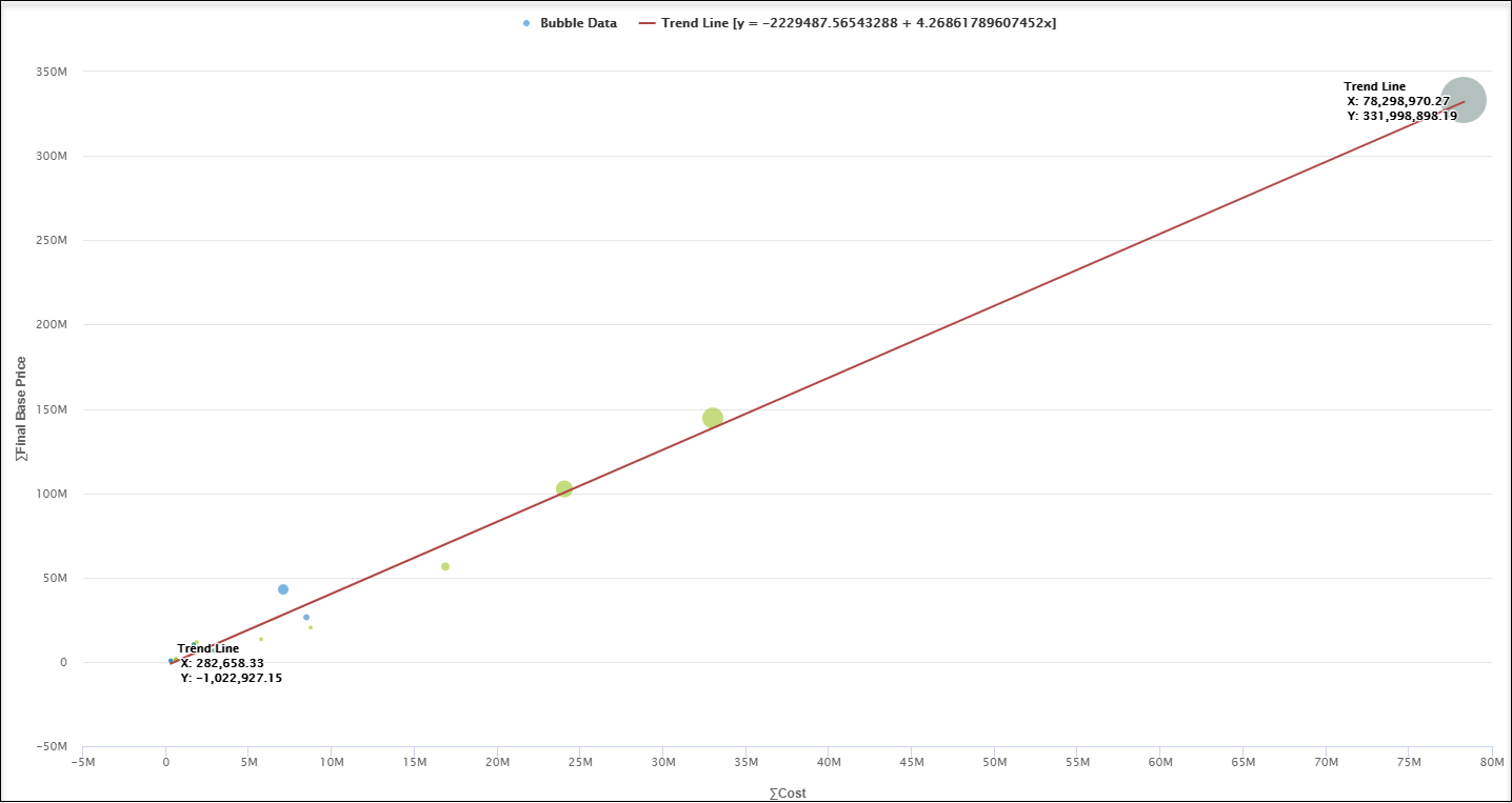
Bubble → Display three dimensions of data for segmentation analysis.
-
Heatmap → Highlight underperforming areas with color-coded matrices.
-
Histogram → Analyze continuous data distributions (e.g., margin spread).
-
Pie → Show proportional distributions (e.g., Invoice Price by Country).
-
Scatter → Identify correlations and outliers.
-
Time Series → Track performance over time, highlight seasonality.
-
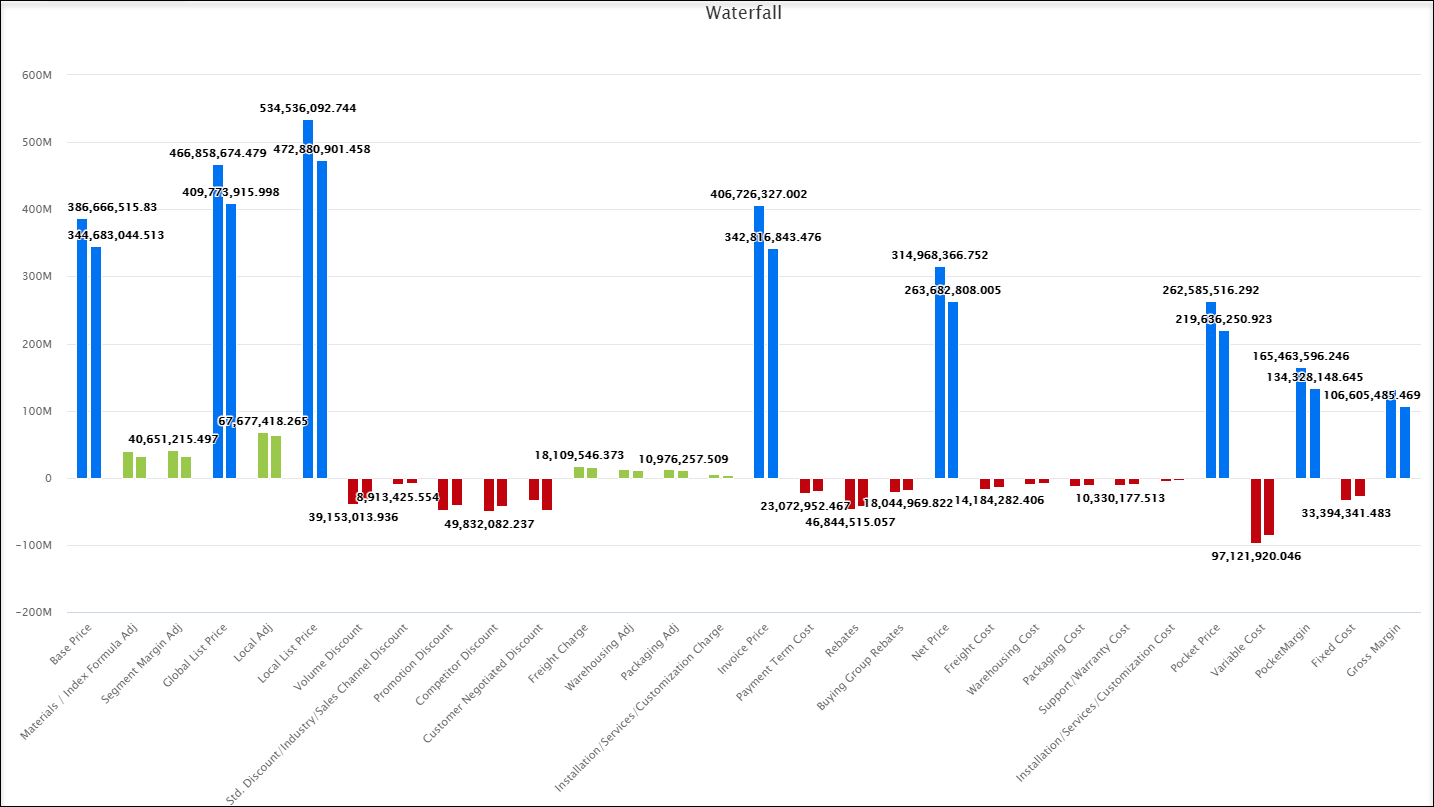
Waterfall → Illustrate sequential price build-up and margin leakage.
-
Waterfall Comparison → Benchmark by customer, product, or year.
These visualization tools help you uncover insights quickly and intuitively.
Out-of-the-Box Analytics Scenarios
1. Running a Pricing Simulation
-
Open the Analytics capability.
-
Select a Datamart with relevant product and transactional data.
-
Choose a chart type (e.g., Scatter or Time Series).
-
Apply simulation rules (e.g., increase base price by 3%).
-
Review the projected impact on margin and customer segments.
2. Creating a New Datamart
-
Upload raw inputs via Data Feeds.
-
Cleanse and enrich data with Data Loads.
-
Define and map structured Data Sources.
-
Build a Datamart combining multiple sources.
-
Deploy for reporting and dashboards.
3. Performing Margin Leakage Review
-
Open Datamart Viewer and select margin-related data.
-
Apply a Waterfall chart to visualize price build-up.
-
Use Waterfall Comparison to benchmark products/customers/years.
-
Drill deeper with Heatmaps or Scatter plots.
-
Recommend corrective actions such as discount limits or pricing adjustments.
The following areas can be managed in the Analytics module:
See Also
-
Analytics tutorial videos explaining all things Analytics.
-
Advanced users and admins can also refer to the Developer Knowledge Base.