
This page details a suite of interconnected dashboards specifically designed for streamlined pricing analysis.
User Flow
Dedicated Pricing Charts and Use Cases
Every dashboard and chart is built to address specific, practical pricing scenarios, product performance diagnostics, price review, and identifying opportunities for uplifts.
Context Linking
Filters and drilldowns are interconnected, ensuring that moving from summary to detail or between dashboards keeps analysis consistent and reduces repetitive filter setup.
Performance and Usability
Dashboards are optimized for speed and clarity, aiming for rapid data rendering, modern visual formatting, and minimal manual steps.
Interaction Example
-
User opens the Insights Dashboards to the overview screen.
-
Notices a margin shortfall in a product category.
-
Clicks through to a customer-centric dashboard (including product filters), with relevant context and filters automatically applied.
-
Identifies a pricing opportunity (e.g. underpriced items or excessive discounting).
-
Defines an Action or Watcher within the dashboard UI, perhaps prompting a price review workflow or delegation to another team member.
Creating actions from Insights Dashboards is only available when Pricefx Agents are installed and configured in your environment.
-
Monitors outcomes and iterates as necessary, all within the connected dashboard environment.
Dashboards User Flow Summary
|
Action |
User Interaction Pattern |
Typical Outcomes |
|---|---|---|
|
Overview and Metric Monitoring |
Select overview dashboard, review KPIs, apply filters |
Identify anomalies/opportunities |
|
Drilldown/Detail Investigation |
Click charts/tables, follow context-linked path to detail |
Root cause analysis for pricing issues |
|
Focused Analysis |
Utilize specialized dashboards (product, price review, etc.) |
Collect actionable insights |
|
Action Creation |
Initiate Action or Watcher directly from dashboard |
Assign formal actions for fixes or escalation |
|
Follow-up (Monitoring) |
Track progress via dashboard-integrated Watcher or action UI |
Close feedback loop on implemented actions |
Connected Dashboards
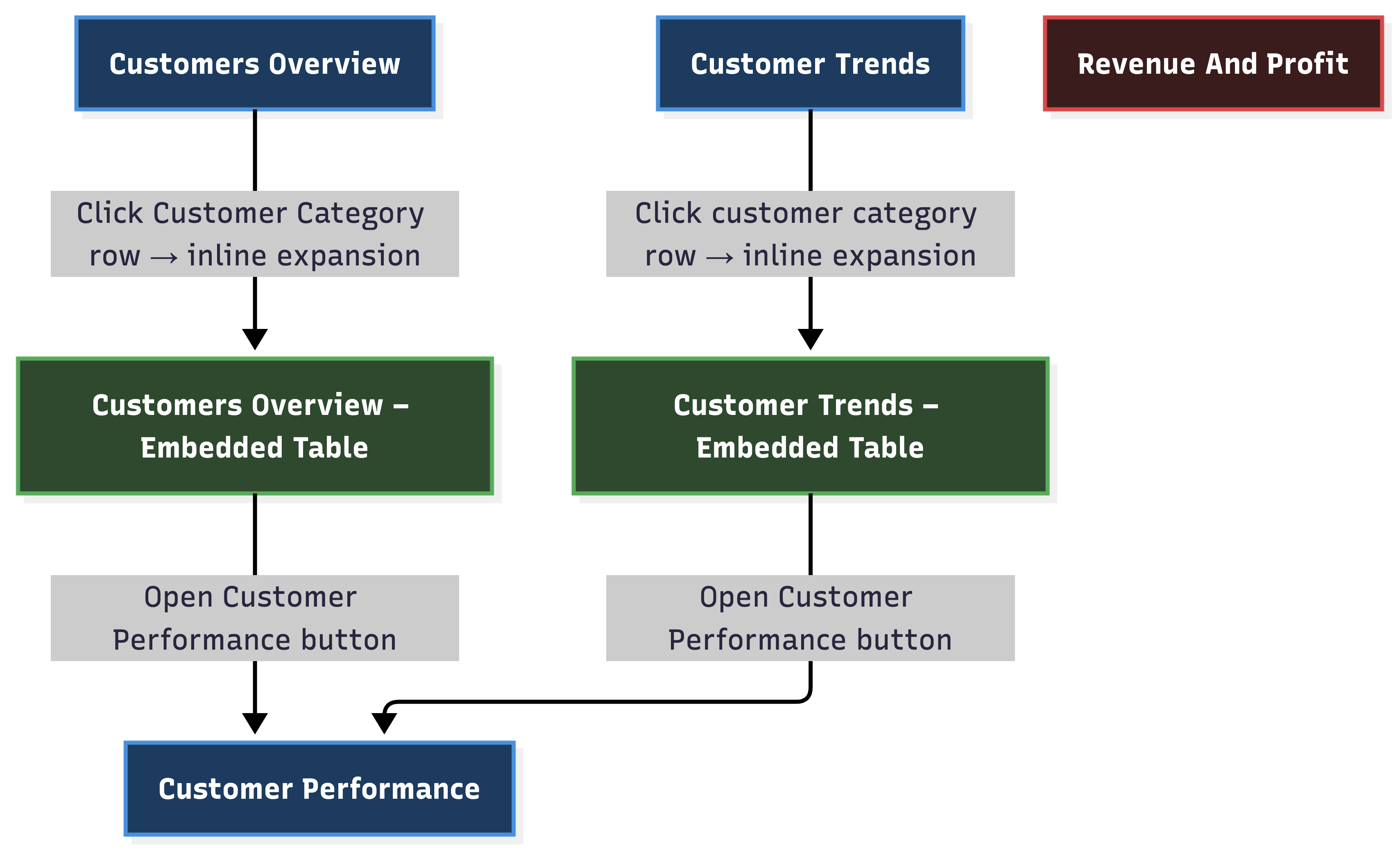
Visualization
|
Chart Type |
Description |
|---|---|
|
Bar Charts |
Display key performance indicators such as Health Score, Margin % and Price Realization, as multi-bar charts. Usually scaled on a normalized (0–100%) axis for comparison across metrics. |
|
Bar and Line Charts |
Used for time series analyses such as Revenue and Margin % Over Time, showing trends month-over-month. Revenue is often shown as bars, Margin % as a line overlay. |
|
Pie Charts |
Show customer or product classifications, demonstrating the relative size of segments within a population (e.g., Customer Performance by Health Score or Revenue). |
|
Bubble and Scatter Charts |
Visualize relationships between two measures (e.g., Revenue vs Margin %) with bubble size indicating revenue. |
|
Heatmaps |
Present distributions such as Health Score by Customer Rank, offering a compact view of performance across groups. |
|
Waterfall Charts |
Breakdown of how initial prices are affected by adjustments (discounts, rebates, costs), illustrating stepwise impacts on final prices and margins. |
|
Hierarchical (Drill-Down) Charts |
Enable drill-down analysis from high-level groupings (business unit, product group) to detailed data for root-cause analysis. |
|
Data Tables |
Tabular reports accompanying charts with configurable options for sorting, summary, and drill-downs. |
Visualization Types in Dashboards
|
Dashboard Name |
Example Visualization Types |
|---|---|
|
|
|
|
|
|
|