The Customer Performance Dashboard provides a comprehensive overview for analyzing customer-related data through various metrics and visualizations. The dashboard provides a view that supports data-driven decision-making, enabling businesses to identify top performers, uncover growth opportunities, and enhance pricing strategies.
Set Up Data and Filters
Data Filter
|
Input |
Description |
|---|---|
|
Customer |
Filters data for the analysis according to the given customer. |
|
Review Period |
Filters data for the analysis according to the given time range. The Review Period filter defaults to the previous 12 months of data. |
|
General Filter |
Allows you to set up a generic transaction data filter. For example: display only data from Europe, or Asia. |
|
Product Hierarchy |
Filters data for the product industry. |
|
Product Rank |
1 - 10 (By default) |
Note there is a known limitation for the Product/Customer attribute dashboard filters. For more information see Limitations (Insights Dashboards) | Filter Attributes Outside Datamart Tables Scope.
More Options
|
Input |
Options |
Description |
|---|---|---|
|
Time Period |
|
Period Type allows to set the Review Period (Month). |
|
Product Category |
|
Defines aggregation level for the Product Category. |
Analyze Results
The dashboard provides the following summaries.
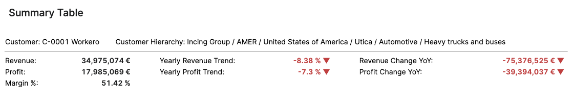
Summary Table
The Summary table provides an effective overview for business monitoring and strategic decision‑making by showing key revenue and profit metrics based on your selected filters. The Summary Table displays aggregated data for selected customer. You can apply filters to focus on a particular Product Hierarchy or Product Rank, adjust the Review Period, and more:
-
Customer (Filter Definition)
-
Review Period (Filter Definition)
-
General Filter (Filter Definition)
-
Product Hierarchy (Filter Definition)
-
Product Rank (Filter Definition)
The Summary table presents the following key figures for the currently selected customer:
-
Revenue (Field Definition)
-
Profit (Field Definition)
-
Margin % (Field Definition)
-
Customer Hierarchy (Field Definition)
-
Yearly Revenue Trend (Field Definition)
-
Yearly Profit Trend (Field Definition)
-
Revenue Change YoY (Field Definition)
-
Profit Change YoY (Field Definition)
The data structure is based on aggregated transactions. All trends are calculated on a yearly basis. The time period is defined by the Review Period filter.
See Also:
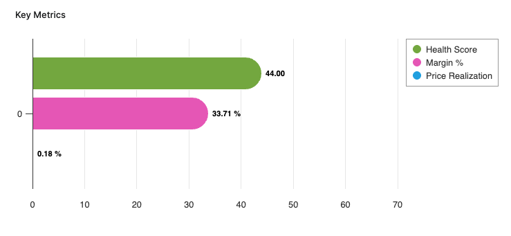
Key Metrics
The Key Metrics chart serves as a focused, comparative visualization of three performance indicators. This chart enables users to monitor the overall financial and commercial health of a selected customer or customer segment over a specified review period. The chart is presented as a multi-bar visualization, where each bar represents one key metric, all plotted on a common, normalized axis ranging from 0 to 100%. The Key Metrics chart displays the following metrics:
-
Health Score (Field Definition)
-
Margin % (Field Definition)
-
Price Realization (Field Definition)
You can apply filters to refine the data. You can filter for a specific customer, set the Review Period, and select other options:
-
Customer (Filter Definition)
-
Review Period (Filter Definition)
-
General Filter (Filter Definition)
-
Product Hierarchy (Filter Definition)
-
Product Rank (Filter Definition)
See Also:
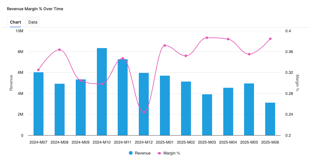
Revenue Margin % Over Time
Helps you analyze the relationship between Revenue and Margin % in the aggregated time (month).
-
X-axis displays the time period aggregation as defined by the Time Period input.
-
Left hand side Y-axis shows the Revenue scale.
-
Right hand side Y-axis shows the Margin % scale.
See Also:
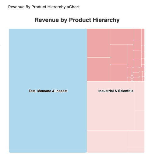
Revenue By Product Hierarchy
The Revenue By Product Hierarchy helps users to analyze revenue distribution across all levels of their product hierarchy within a selected period.
-
The chart provides insight into the revenue performance of each product hierarchy level, helping users to:
-
Identify top-performing segments.
-
Spot underperforming product groups.
-
Understand the contribution of each hierarchy level to overall revenue.
-
-
Drilldown capabilities allow users to progressively explore revenue figures from higher-level categories down to more granular levels, supporting root cause analysis and targeted performance reviews.
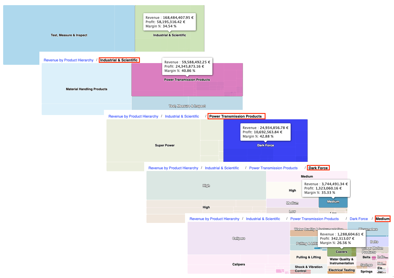
Revenue By Product Hierarchy Chart Drilldown Options -
Supplemental metrics such as profit and margin percentage are accessible via tooltips, providing additional context on profitability and efficiency at each product hierarchy level.
See Also:
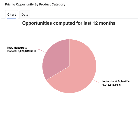
Pricing Opportunity By Product Category
The Pricing Opportunity By Product Category chart provides a visual representation of the total pricing opportunity segmented by product category, identifying where the greatest potential for revenue growth exists across the organization's product categories over a defined period.
It is a pie chart, with each slice representing a specific product category as defined by the highest available level in the product hierarchy. The size of each slice corresponds to the aggregated pricing opportunity for that category, as calculated over the last 12 full months (L12M). If more than seven product categories are present, the chart consolidates the least significant categories into an "Others" segment to maintain clarity.
The Pricing Opportunity By Product Category chart helps users to:
-
Quickly identify product categories with the highest pricing opportunities and associated cross-sell potential.
-
Understand how opportunity is distributed across the portfolio.
-
Prioritize sales and pricing actions where the greatest impact may be achieved.
See Also:
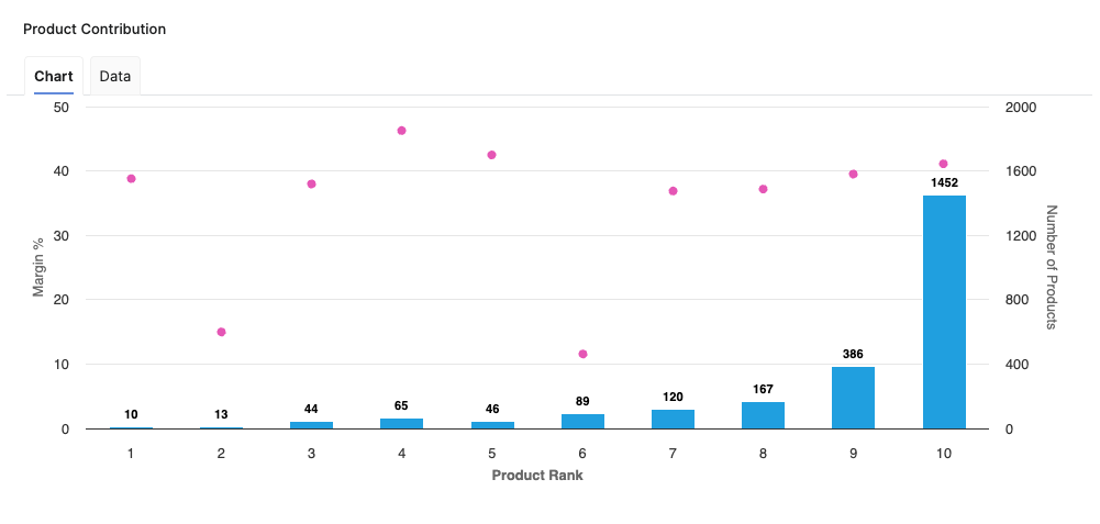
Product Contribution
The Product Contribution chart enables users to easily identify which products contribute most significantly to key business profitability indicators, supporting strategic decision-making and portfolio optimization. Chart provides an overview of how individual or grouped products perform in terms of revenue generation, profitability, and margin contribution. This supports identification of top-performing and underperforming products within the portfolio.
The chart displays data in a form of bars. Bars represent margin percentages, while a secondary indication highlights product counts.
-
X-axis represents the Product Rank, allowing users to see the order of contribution based on revenue share.
-
Y-axis displays the Margin percentage to quickly convey relative profitability.
-
Z-axis represents the Number of Products in each product rank.
The Product Contribution chart helps users to:
-
Identify high-margin, high-revenue products that drive overall profitability.
-
Detect products with lower margin contributions, guiding portfolio reviews and potential improvement actions.
-
Support resource allocation and promotional efforts based on quantitative product-level performance.
-
Make data-driven decisions for discontinuing, repositioning, or investing in specific product lines.
See Also:
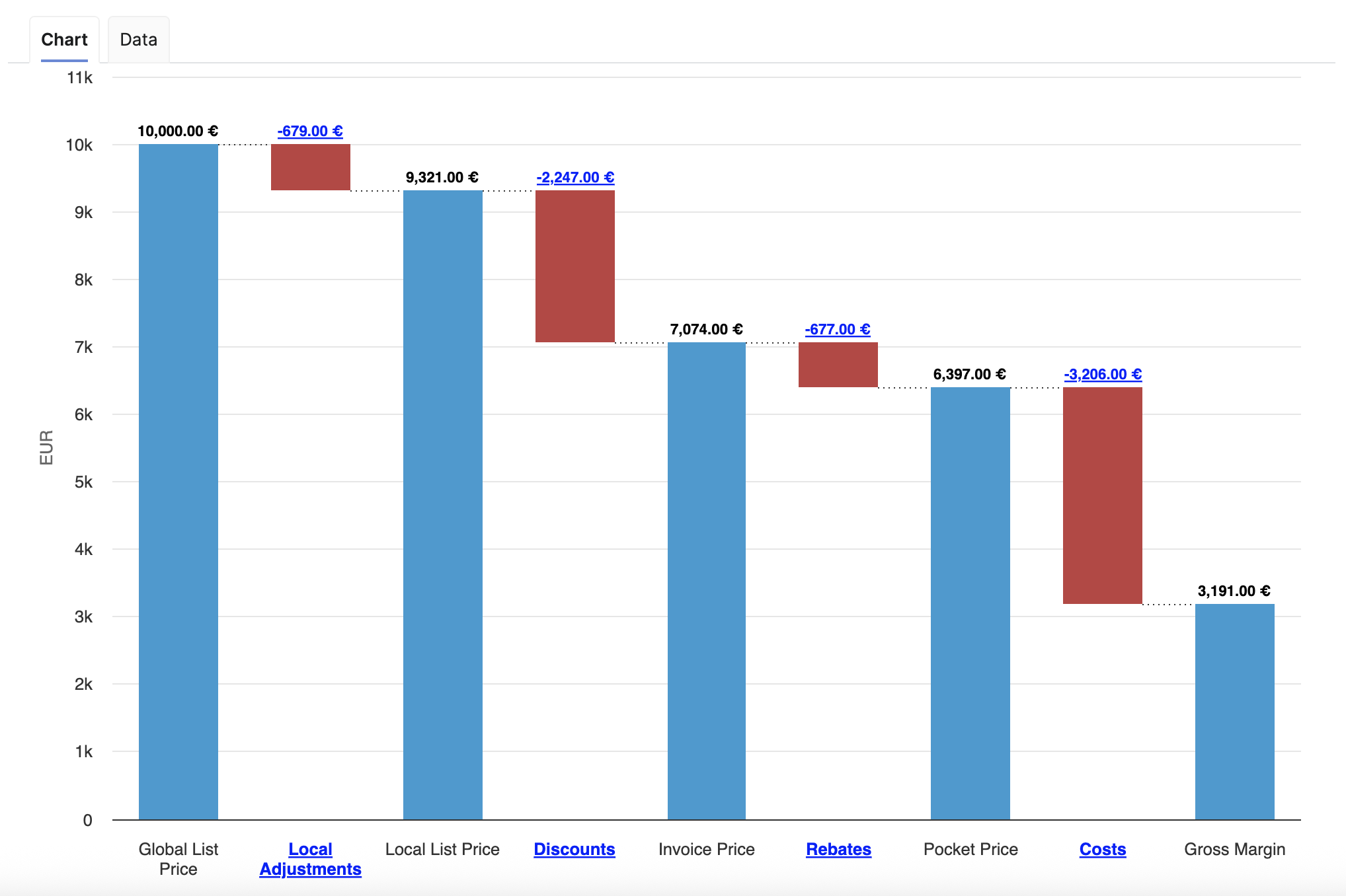
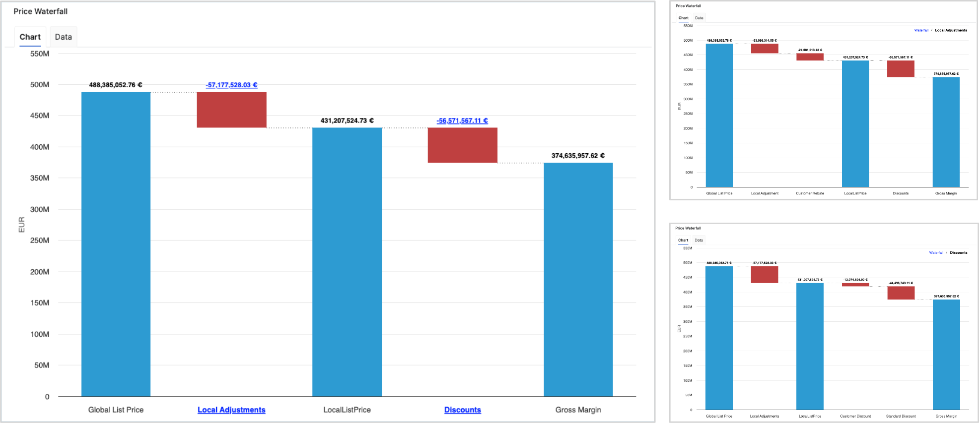
Price Waterfall
The Price Waterfall chart presents a standardized price waterfall analysis, enabling users to understand the impact of a sequence of intermediate positive and negative values on an initial value. The Price Waterfall chart provides a comprehensive overview of how initial pricing is adjusted by various factors, ultimately influencing what a customer actually pays. This visualization is essential for assessing pricing strategies and understanding profit dynamics. The columns within the chart are color-coded to effectively distinguish between positive and negative values.
Example Price Waterfall Setup
The following elements and values used in this example Price Waterfall setup are provided for illustration and recommendation purposes only and are not part of the standard solution by default. Each user is responsible for configuring their own Price Waterfall to match their specific use case, business logic, and data model. Before using this example in a production environment, the setup and all underlying assumptions must be reviewed, adapted, and validated against the user’s own data and requirements.
The columns present the following total values:
-
Global List Price
-
Local Adjustments
-
Local List Price
-
Discounts
-
Invoice Price
-
Rebates
-
Pocket Price (Realized)
-
Costs
-
Gross Margin
The chart outlines several key components that contribute to the transformation from the initial list price to the net price realized by the company. These components, identified as pillars, include:
-
Global List Price – The original price proposed to customers prior to any adjustments.
-
Local Adjustments – These adjustments address foreign exchange variations and local market conditions that can affect pricing.
-
Local List Price – Reflects the price after accounting for local adjustments.
-
On-Invoice Discounts – Discounts applied directly on customer invoices, affecting the final price paid.
-
Rebates – Financial incentives provided post-purchase to encourage customer loyalty or volume purchases.
-
Pocket Price (Realized Price) – This is the actual amount received after all adjustments, representing revenue that contributes to gross margin calculations.
-
Costs and Gross Margin – The chart also details associated costs, allowing for an examination of gross margin following all discounts and adjustments.
For more information see Price Waterfall Components.
To refine the data presented in the chart, users can apply several filters:
-
Customer (Filter Definition)
-
Review Period (Filter Definition)
-
General Filter (Filter Definition)
-
Product Hierarchy (Filter Definition)
-
Product Rank (Filter Definition)
Additionally, the chart features data labels and a data tab, along with the capability to drill down to one level deeper within the waterfall.
See Also:
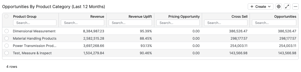
Opportunities By Product Category (Last 12 Months)
The Opportunities By Product Category table is specifically designed to provide insights into potential revenue enhancements across various product categories over the past twelve months. The table includes several crucial metrics that allow users to effectively evaluate opportunities and make informed decisions.
The columns in this table are as follows:
-
Product Category – This column displays the product category selected in the Product Category input above and categorizes products by that chosen class.
-
Revenue – Total revenue generated by the product categories listed in that row.
-
Revenue Uplift – The percentage increase in revenue attributable to pricing opportunities and cross-sell strategies.
-
Pricing Opportunity – Represents the potential revenue that could be realized from pricing adjustments, also expressed in monetary terms.
-
Cross Sell – Indicates the monetary value of cross-selling opportunities that could arise from existing customer relationships.
-
Opportunities – Displays the total monetary value of identified opportunities.
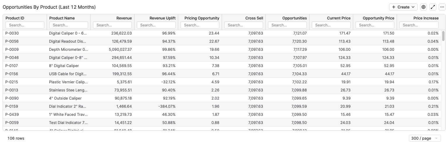
Opportunities By Product (Last 12 Months)
The Opportunities By Product (Last 12 Months) table shows, for the selected customer and filters, how much realized revenue and additional revenue potential exists for each individual product over the last 12 full months (L12M).
The columns in this table are as follows:
-
Product ID – Product identifier used to group all opportunity and revenue measures for that product.
-
Product Name – Readable product label that helps business users identify the product without relying on technical IDs.
-
Revenue – Total revenue generated by the product for the selected customer over the last 12 months, calculated as the sum of revenue in the L12M data structure.
-
Revenue Uplift – Percentage share of additional revenue that could be realized from pricing opportunities, higher values indicate larger relative uplift potential.
-
Pricing Opportunity – Monetary value of identified pricing improvement potential for the product over the last 12 months, summed from the L12M opportunity data.
-
Cross Sell – Monetary value of cross‑sell potential for the product over the last 12 months, derived from the same L12M opportunity data and indicating additional revenue that could come from selling complementary or related items.
-
Current Price – Current unit price of the product, fetched from the Price field in the Customer Product Rolling data structure.
-
Opportunity Price – Target or opportunity unit price for the product, fetched from the Opportunity Price field in Customer Product Rolling.
-
Price Increase – Relative price uplift between Opportunity Price and Current Price, calculated as Opportunity Price / Current Price – 1, showing how much the price would need to increase to realize the full pricing opportunity.
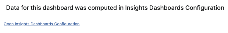
Model Information Portlet
Model information portlet is located at the bottom of the dashboard. Portlet shows which Insights Dashboards Configuration model object the dashboard is currently using as its data source. The portlet displays the name of the model (not the label, which can be empty) and provides a direct link to open the model. This information is read-only and is designed purely for transparency: users can quickly verify the model behind the dashboard data and, if needed, navigate to the model definition for further analysis or to coordinate changes with administrators.
See Also: