The Customer Trends Dashboard delivers actionable insights into customer behavior by enabling organizations to monitor revenue, profit, and margin trends across various customer segments. Using advanced visualizations you can identify evolving performance patterns, assess customer health score, and support strategic decision-making. This approach helps users to uncover growth opportunities, optimize customer relationships, and drive sustained profitability.
Set Up Data and Filters
Data Filter
|
Input |
Description |
|---|---|
|
Customer Hierarchy |
Filters data for the customer industry. |
|
Customer Rank |
1 - 10 (By default)
|
|
Customer Health Score |
1 - 100 (By default)
|
|
Customer |
Filters data for the analysis according to the given customer. |
Note there is a known limitation for the Product/Customer attribute dashboard filters. For more information see Limitations (Insights Dashboards) | Filter Attributes Outside Datamart Tables Scope.
More Options
|
Input |
Options |
Description |
|---|---|---|
|
Time Period |
|
Period Type allows to set the Review Period (Month). |
|
Customer Category Aggregation Level |
|
Defines aggregation level for the Customer Category.
|
Analyze Results
The dashboard provides the following summaries.
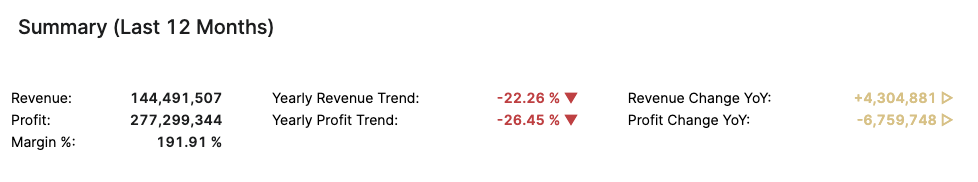
Summary (Last 12 Months)
The Summary table provides an effective overview for business monitoring and strategic decision‑making by showing key revenue and profit metrics based on your selected filters. The default view of the Summary table displays aggregated data for all customers. You can apply filters to focus on a particular customer, and more:
-
Customer Hierarchy (Filter Definition)
-
Customer Rank (Filter Definition)
-
Customer Health Score (Filter Definition)
-
Customer (Filter Definition)
The Summary table presents the following key figures for the currently selected customer:
-
Revenue (Field Definition)
-
Profit (Field Definition)
-
Margin % (Field Definition)
-
Yearly Revenue Trend (Field Definition)
-
Yearly Profit Trend (Field Definition)
-
Revenue Change YoY (Field Definition)
-
Profit Change YoY (Field Definition)
The data structure is based on aggregated transactions. All trends are calculated on a yearly basis.
See Also:
Key Metrics
The Key Metrics chart serves as a focused, comparative visualization of three performance indicators. This chart enables users to monitor the overall financial and commercial health of a selected customer or customer segment over a specified review period. The chart is presented as a multi-bar visualization, where each bar represents one key metric, all plotted on a common, normalized axis ranging from 0 to 100%. The Key Metrics chart displays the following metrics:
-
Health Score (Field Definition)
-
Margin % (Field Definition)
-
Price Realization (Field Definition)
You can apply filters to refine the data. You can filter for a specific customer, set the Review Period, and select other options:
-
Customer Hierarchy (Filter Definition)
-
Customer Rank (Filter Definition)
-
Customer Health Score (Filter Definition)
-
Customer (Filter Definition)
See Also:
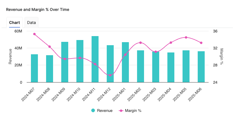
Revenue and Margin % Over Time
Helps you analyze the relationship between Revenue and Margin % in the aggregated time (month).
-
X-axis displays the time period aggregation as defined by the Time Period input.
-
Left hand side Y-axis shows the Revenue scale.
-
Right hand side Y-axis shows the Margin %
See Also:
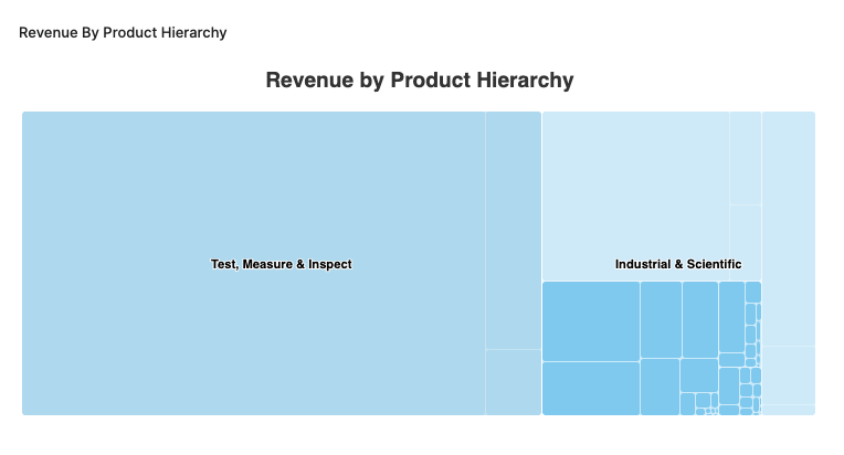
Revenue By Product Hierarchy
The Revenue By Product Hierarchy helps users to analyze revenue distribution across all levels of their product hierarchy within a selected period.
-
The chart provides insight into the revenue performance of each product hierarchy level, helping users to:
-
Identify top-performing segments.
-
Spot underperforming product groups.
-
Understand the contribution of each hierarchy level to overall revenue.
-
-
Drilldown capabilities allow users to progressively explore revenue figures from higher-level categories down to more granular levels, supporting root cause analysis and targeted performance reviews.
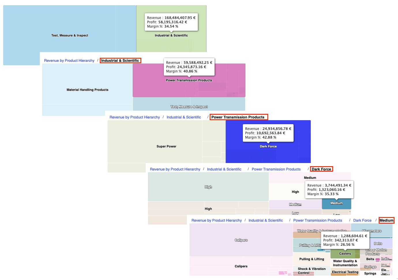
Revenue By Product Hierarchy Chart Drilldown Options -
Supplemental metrics such as profit and margin percentage are accessible via tooltips, providing additional context on profitability and efficiency at each product hierarchy level.
See Also:
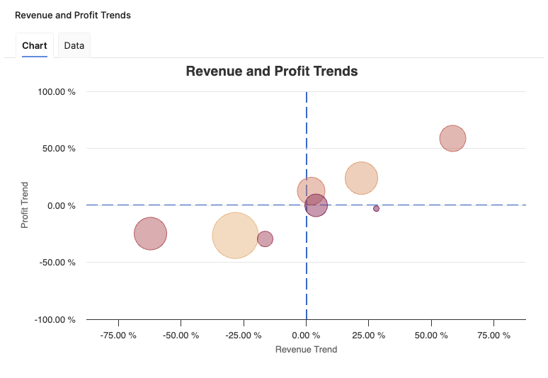
Revenue and Profit Trends
The Revenue and Profit Trends chart provides a comprehensive visual analysis of how customer revenue and profit are trending, supporting assessment of business health and strategic decision-making. The chart enables users to rapidly identify which customers or segments are showing positive or negative directional movement in revenue and profit. Chart is presented as a bubble chart, where each bubble represents a single customer or a customer segment, aggregated according to user selection. The size of each bubble reflects the revenue generated by the corresponding customer.
-
X-axis displays the Revenue Trend.
-
Y-axis displays the Profit Trend as a percentage.
-
Visual reference lines:
-
Vertical dotted line at Zero Revenue Trend.
-
Horizontal dotted line at Zero Profit Trend.
-
The chart helps users to identify which customers or segments are showing positive or negative directional movement in revenue and profit. The dual-axis visualization facilitates correlation between revenue and profit developments, while the use of bubble size highlights the financial importance of each aggregation.
See Also:
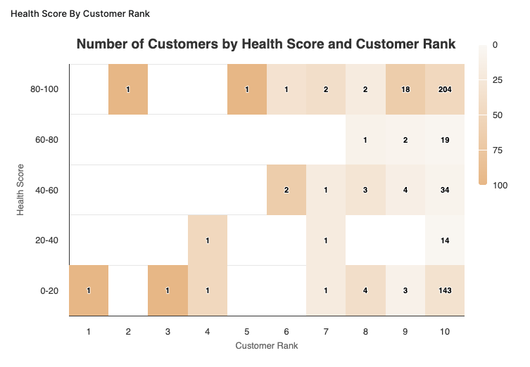
Health Score By Customer Rank
The Health Score By Customer Rank chart provides valuable insights into customer performance by measuring health scores against customer ranks. The chart is presented as a heatmap, where the X-axis represents the Customer Rank and the Y-axis depicts the Health Score. This visual representation allows users to observe the distribution of customer health scores across different ranks effectively.
-
X-axis displays the Customer Rank.
-
Y-axis displays the Health Score.
The chart utilizes a heatmap to display the density of customers within each rank and their corresponding health scores. Each cell in the heatmap represents the count of unique customer id's within that specific rank with a corresponding health score. The Health Score By Customer Rank chart provides information for strategic decision-making, enabling stakeholders to identify segments of customers requiring attention and facilitating targeted interventions based on health score.
See Also:
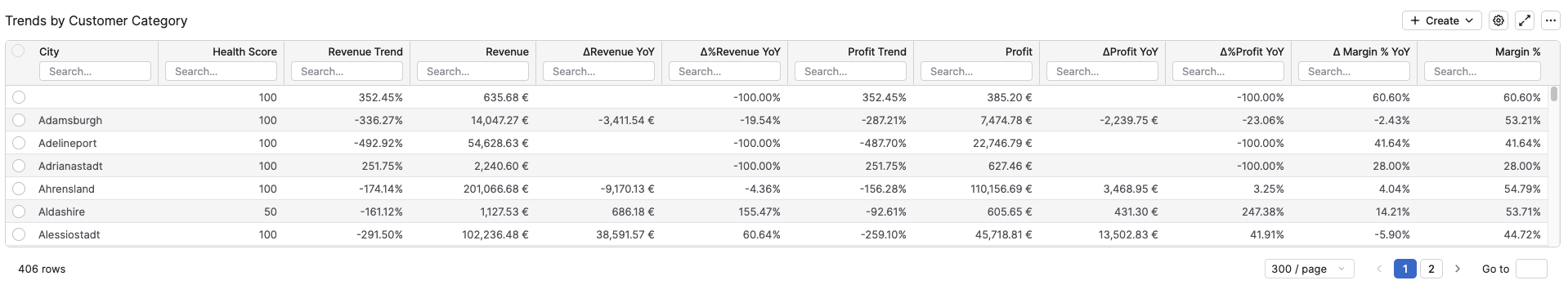
Trends by Customer Category
The Trends by Customer Category provides essential insights into customer performance across various metrics. The highlighted fields and their implications are described as follows:
The columns in this table are as follows:
-
Customer Category Aggregation Level – This column stands for the first level of the Customer Hierarchy defined in Defined in Configuration Step.
-
Health Score – Is calculated as the average of the health scores for the different customer categories. A higher health score indicates better financial health and customer engagement.
-
Revenue Trend – Represents the percentage change in revenue over time, offering a clear view of growth or decline relative to previous periods.
-
Revenue – The total revenue value for each customer category reflecting the overall sales performance.
-
ΔRevenue YoY – Indicates the change in revenue year-over-year, helping businesses understand the trajectory of their financial performance.
-
Δ%Revenue YoY – Reflects the percentage of year-over-year revenue change, providing insights into growth relative to the previous year.
-
Profit Trend – Represents the percentage change in profit over time, offering a clear view of growth or decline relative to previous periods.
-
Profit – Total profit for each customer category, crucial for evaluating the core profitability.
-
ΔProfit YoY – Highlights the annual change in profit, allowing for assessments of profit stability or volatility.
-
Δ%Profit YoY – Percentage change in profit compared to the previous year, which helps gauge profitability growth rates.
-
Δ%Margin YoY – Indicates the year-over-year margin percentage change, critical for understanding factors affecting profitability.
-
Margin % – Calculates the profitability margin as a percentage, revealing how much profit is made for every dollar of revenue.
The Trends by Customer Category table is vital for users seeking to monitor customer health and financial performance across different categories. The metrics allow for a performance overview, enabling informed decision-making regarding resource allocation, strategy formulation, and identification of both growth opportunities and areas requiring improvements.
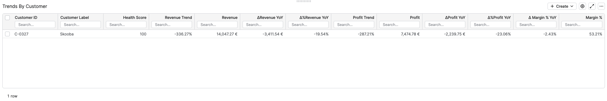
Trends By Customer
The Trends by Customer table provides a customer‑level view of financial performance and health over the last 12 months, allowing you to compare individual customers by their revenue, profit, margin, health score, and year‑over‑year changes.
-
Customer ID – Technical identifier of the customer used by the underlying data model and rollup logic.
-
Customer Label – Business‑friendly customer name shown in the application for easier interpretation of results.
-
Health Score – Average health score for the customer over the evaluated period, combining revenue and profit‑based health indicators into a single value between 1 and 100 (by default).
-
Revenue Trend % – Revenue‑weighted trend indicator showing how the customer’s revenue is evolving over time; positive values indicate growing revenue, negative values indicate decline.
-
Revenue – Total revenue generated by the customer over the last 12 months, computed as the sum of all revenues for that customer.
-
ΔRevenue YoY – Absolute year‑over‑year change in revenue, calculated as Revenue last 12 months – Revenue previous 12 months for the customer.
-
Δ%Revenue YoY – Relative year‑over‑year change in revenue, calculated as Revenue last 12 months / Revenue previous 12 months – 1, showing growth or decline in percentage terms.
-
Profit Trend % – Revenue‑weighted trend indicator showing how the customer’s profit is evolving over time; positive values indicate improving profit, negative values indicate deterioration.
-
Profit – Total profit generated by the customer over the last 12 months, computed as the sum of all profits for that customer.
-
ΔProfit YoY – Absolute year‑over‑year change in profit, calculated as Profit last 12 months – Profit previous 12 months for the customer.
-
Δ%Profit YoY – Relative year‑over‑year change in profit, calculated as Profit last 12 months / Profit previous 12 months – 1, indicating how quickly profitability is improving or declining.
-
ΔMargin % YoY – Year‑over‑year change in margin percentage, calculated as Current Margin % – Previous Margin %, highlighting improvements or deterioration in profitability efficiency for the customer.
-
Margin % – Profitability ratio for the customer over the last 12 months, calculated as SUM(Profit) / SUM(Revenue), showing how much profit is generated per unit of revenue.
Model Information Portlet
Model information portlet is located at the bottom of the dashboard. Portlet shows which Insights Dashboards Configuration model object the dashboard is currently using as its data source. The portlet displays the name of the model (not the label, which can be empty) and provides a direct link to open the model. This information is read-only and is designed purely for transparency: users can quickly verify the model behind the dashboard data and, if needed, navigate to the model definition for further analysis or to coordinate changes with administrators.
See Also: