Revenue and Profit Dashboard helps you visualize and analyze the relationship between Revenue and Margin % from different perspectives of time, product and customer. You can customize the date range and set of products/customers for analysis.
Set Up Data and Filters
Data Filter
|
Input |
Description |
|---|---|
|
Customer(s) |
Allows to choose one (or more) of customer attributes to be used for the analysis. |
|
Product(s) |
Allows to choose one (or more) of product attributes to be used for the analysis. |
|
Review Period |
Filters data for the analysis according to the given time range. The Review Period filter defaults to the previous 12 months of data. |
|
General Filter |
Allows you to set up a generic transaction data filter. For example: display only data from Europe, or Asia. |
Note there is a known limitation for the Product/Customer attribute dashboard filters. For more information see Limitations (Insights Dashboards) | Filter Attributes Outside Datamart Tables Scope.
More Options
|
Input |
Options |
Description |
|---|---|---|
|
Period Type |
|
Period Type allows to set the Review Period. |
|
Customer Category |
Options are defined by Customer Hierarchy |
Defines the aggregation level for Revenue and Margin % by Customer Category. Default is the second level of the configured Customer Hierarchy. |
|
Color Customer By |
Options are defined by Customer Hierarchy |
Defines the field used to color data for Revenue and Margin % by Customer Category. Defaults to the first level of the Customer Hierarchy. |
|
Product Category |
Options are defined by Product Hierarchy |
Defines the aggregation level for Revenue and Margin % by Product Category. Default is the second level of the configured Product Hierarchy. |
|
Color Product By |
Options are defined by Product Hierarchy |
Defines the field used to color data for Revenue and Margin % by Product Category. Defaults to the first level of the Product Hierarchy. |
|
Revenue Axis Scale |
|
Allows to define the type of X axis used on the charts. This setting affects only the Revenue and Margin % by Product Category, Revenue and Margin % by Customer Category charts. |
Analyze Results
The dashboard provides the following summaries.
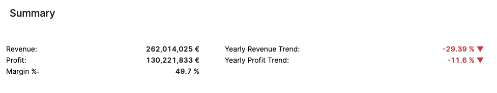
Summary
The Summary table provides an effective overview for business monitoring and strategic decision‑making by showing key revenue and profit metrics based on your selected filters. The default view of the Summary table displays aggregated data for all customers. You can apply filters to focus on a particular customer, adjust the Review Period, and more:
-
Customer(s) (Filter Definition)
-
Product(s) (Filter Definition)
-
Review Period (Filter Definition)
-
General Filter (Filter Definition)
The Summary table presents the following key figures for the currently selected customer:
-
Revenue (Field Definition)
-
Profit (Field Definition)
-
Margin % (Field Definition)
-
Yearly Revenue Trend (Field Definition)
-
Yearly Profit Trend (Field Definition)
The data structure is based on aggregated transactions. All trends are calculated on a yearly basis. The time period is defined by the Review Period filter.
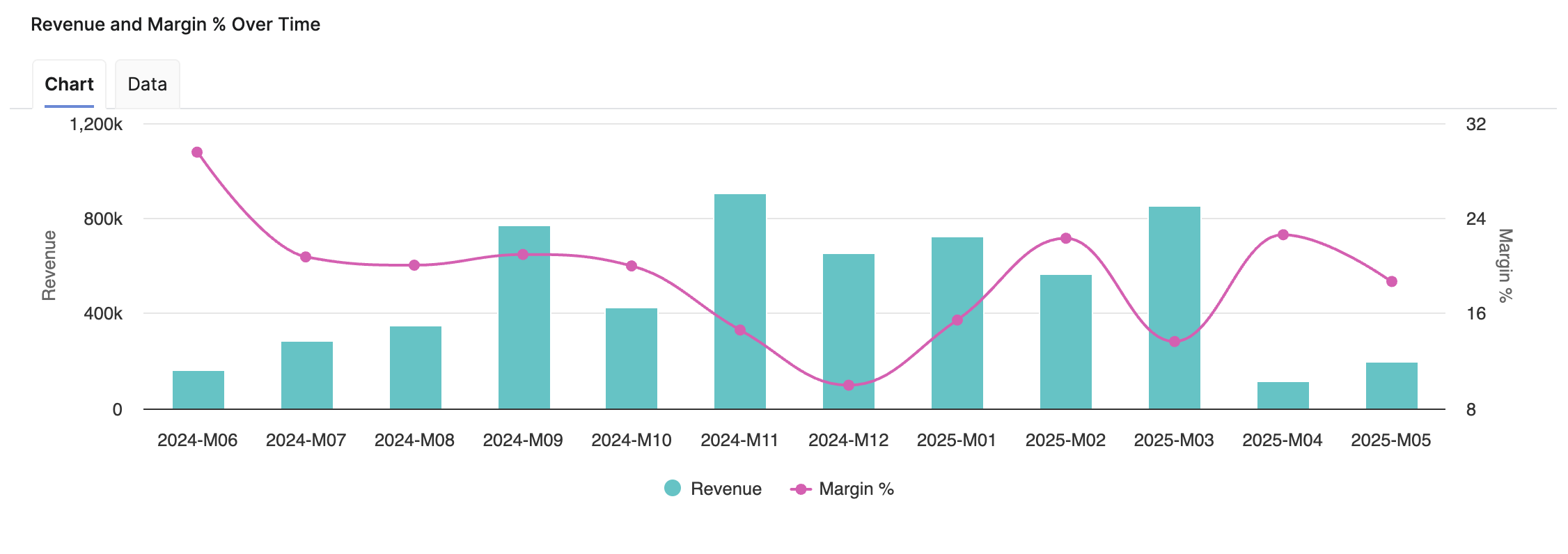
Revenue and Margin % Over Time
Helps you analyze the relationship between Revenue and Margin % in the aggregated time (month).
-
X-axis displays the time period aggregation as defined by the Time Period input.
-
Left hand side Y-axis shows the Revenue scale.
-
Right hand side Y-axis shows the Margin % scale.
See Also:
Revenue and Margin % by Product Category
Helps you analyze the relationship between Revenue and Margin % on the product level using the selected aggregation and visualize the correlation per the chosen product attribute.
-
X-axis displays the sum of Revenue per chosen product aggregation.
-
Y-axis displays the sum of Margin % for the whole chosen category.
-
The first line is horizontal and is set at the average margin %, and the second line is vertical and is set at the average revenue value. This divides the chart into four sections.
How Aggregation and Coloring Work
-
The Product Category Aggregation filter manages what data points you can see. If you choose the
ProductLinein the Product Category filter, you should see a point for every Product Line in the data. -
The Color Product By filter manages how to color the data. So colors will be assigned based on this input. If you choose the
ProductId, each Product ID datapoint will have its own color. -
If the Color Product By has a smaller granularity than the Product Category Aggregation, it will override the Product Category Aggregation.
Example
If you request to color by ProductId but aggregate by ProductLine, aggregation will not happen, because then Color Product By would not know how to color it. The chart will look the same way as if you selected ProductId as aggregation.
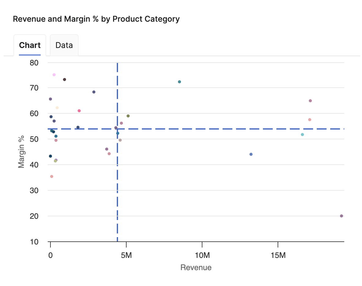
If you choose the same hierarchy level and value for Product Category and Color Product By, the chart uses one color for all points. Use a different attribute in Color Product By (for example, a different level of the product hierarchy) to color-code categories.
Key Insights
-
Bottom Left Section – Shows products with low margin % & low revenue. For these products consider raising their price, so that they move up to the top (their margin increases) or work on increasing the volume of sold products (and thus move right towards a bigger revenue). The optimal move here is to go with the product to the top right sections (i.e. increase both margin and revenue).
-
"Risky Business" in Top Right Section – This may mean that a customer buys large quantities for a high price. There is a risk of losing such a customer if they find out that others get the same product for a lower price. The optimal scenario is to have the dots grouped around some average price value.
See Also:
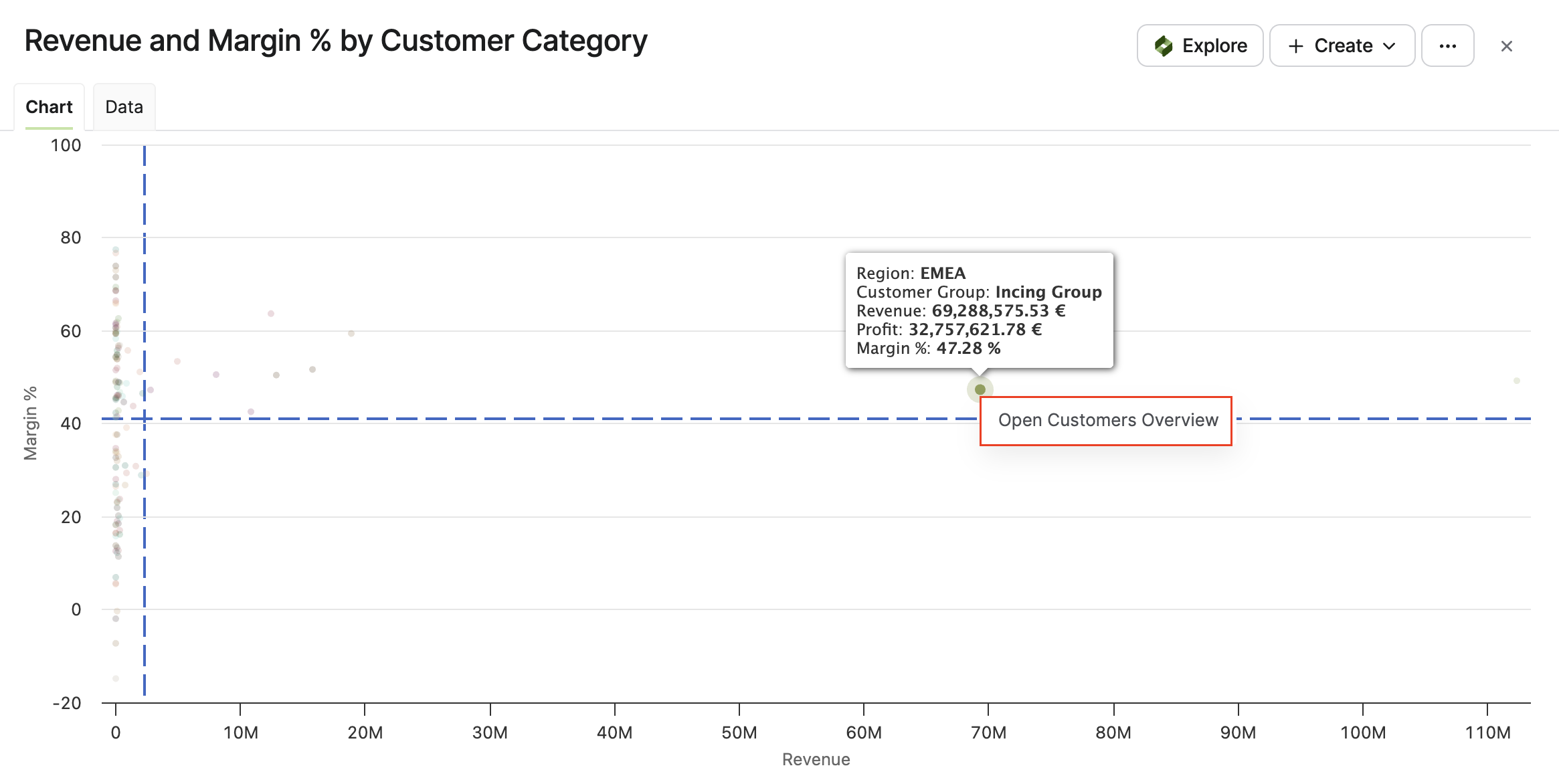
Revenue and Margin % by Customer Category
Helps you analyze the relationship between Revenue and Margin % on the customer level using the selected aggregation. The data points in the analysis can be colored by the customer dimensions set by the Color Customer By filter which helps you visualize the relationship per the chosen customer attribute.
-
X-axis displays the sum of Revenue per chosen customer aggregation.
-
Y-axis displays the sum of Margin % for the whole chosen category.
-
The first line is horizontal and is set at the average margin %, and the second line is vertical and is set at the average revenue value. This divides the chart into four section
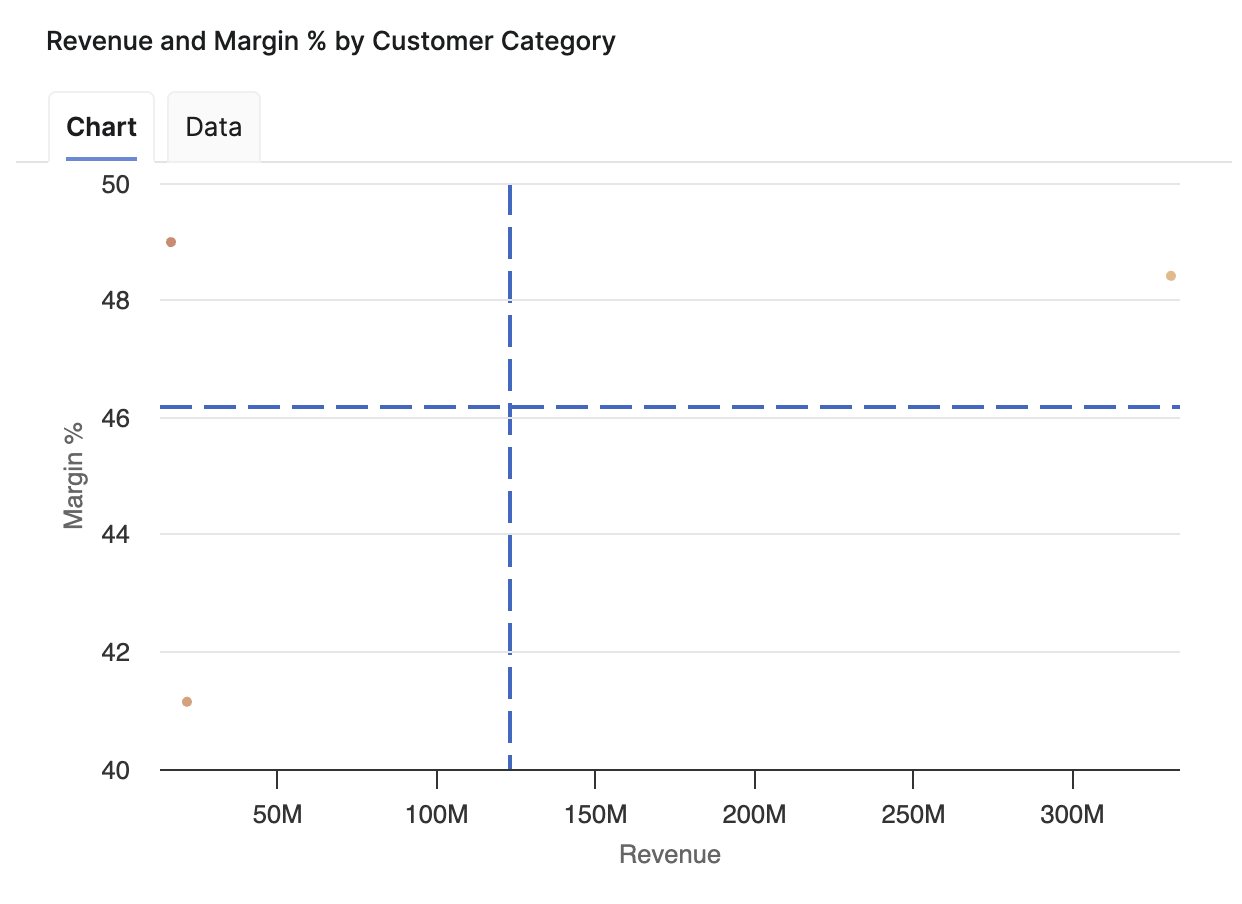
If you choose the same hierarchy level and value for Customer Category and Color Customer By, the chart uses one color for all points. Use a different attribute in Color Customer By to differentiate categories visually.
Key Insights
-
The chart shown above illustrates that it may happen that large customers generating large revenue may not reach the optimal margin, yet it pays off to keep these customers.
-
On the other hand, small customers get the products for higher prices and generate larger margin.
Navigate to Customers Overview
From the Revenue and Margin % by Customer Category chart, you can navigate directly to the Customers Overview Dashboard for a specific customer category. When you hover over a data point, the tooltip displays the customer details and an Open Customers Overview link (left click). Click the Open Customers Overview to open the Customers Overview Dashboard filtered to that customer category.
See Also:
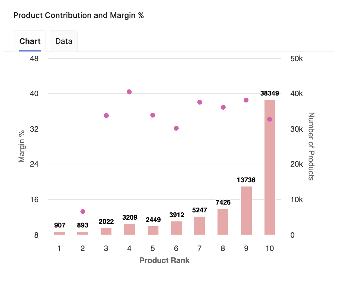
Product Contribution and Margin %
The Product Contribution and Margin % chart visualizes the following metrics:
-
Margin % (left Y-axis)
-
Number of Products (right Y-axis)
-
Product Rank (X-axis).
The Product Rank ranges from 1 to 10 (by default), representing product groupings into ranking positions. The number of ranks is defined within the Model (Optimization > Model).
The chart visually highlights the relation between contribution (Number of Products) and profitability (Margin %) across the product ranks.
If there are no transactions in the last 12 months for a given rank bucket, the dashboard can display an additional rank +1 bucket. This behavior is expected and results from how rank buckets are calculated from L12M revenue.
See Also:
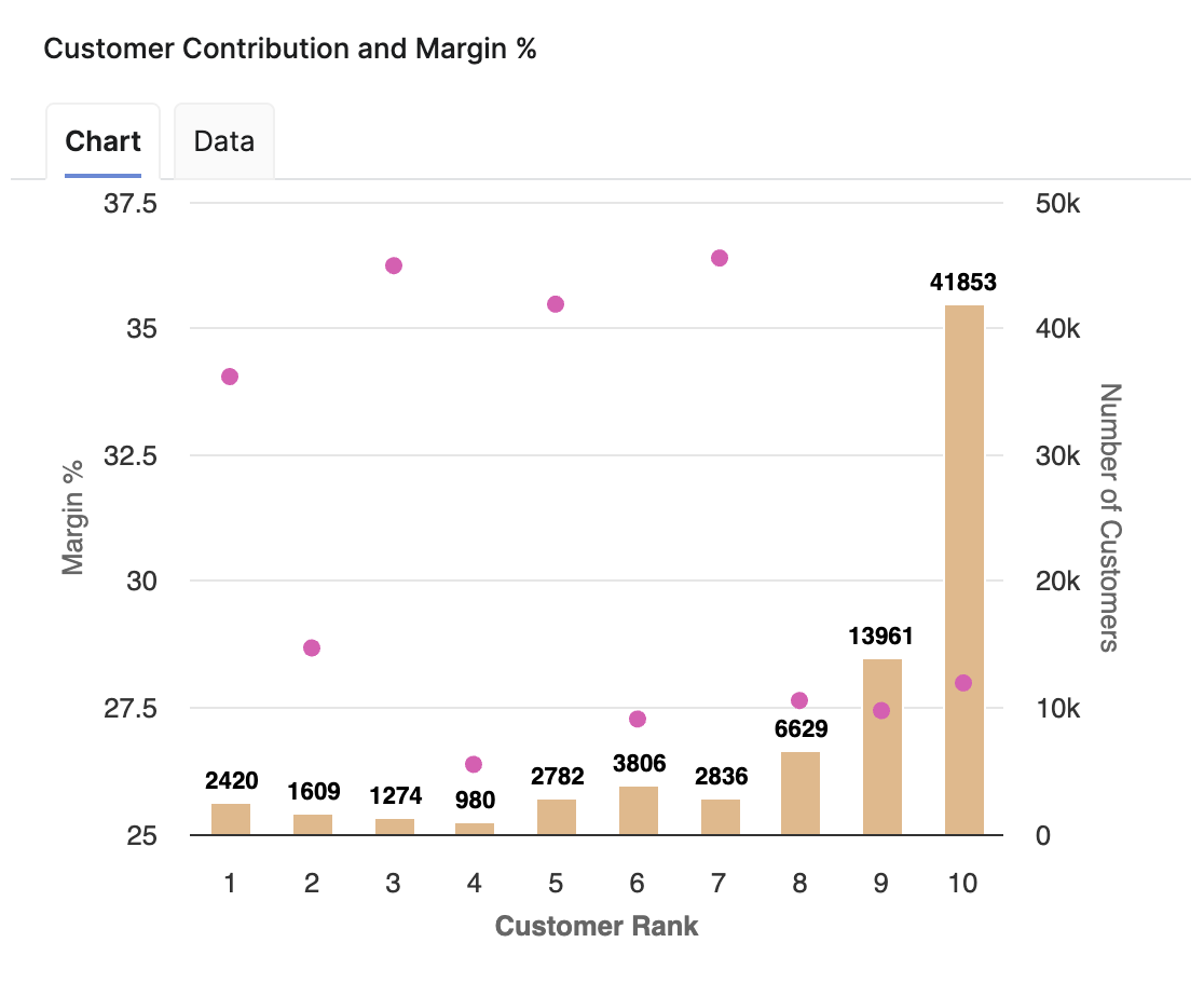
Customer Contribution and Margin %
The Customer Contribution and Margin % chart visualizes the following metrics:
-
Margin % (left Y-axis)
-
Number of Customers (right Y-axis)
-
Customer Rank (X-axis).
The Customer Rank ranges from 1 to 10 (by default), representing product groupings into ranking positions. The number of ranks is defined within the Model (Optimization > Model).
The chart visually highlights the relation between contribution (Number of Customers) and profitability (Margin %) across the customer ranks.
If there are no transactions in the last 12 months for a given rank bucket, the dashboard can display an additional rank +1 bucket. This behavior is expected and results from how rank buckets are calculated from L12M revenue.
See Also:
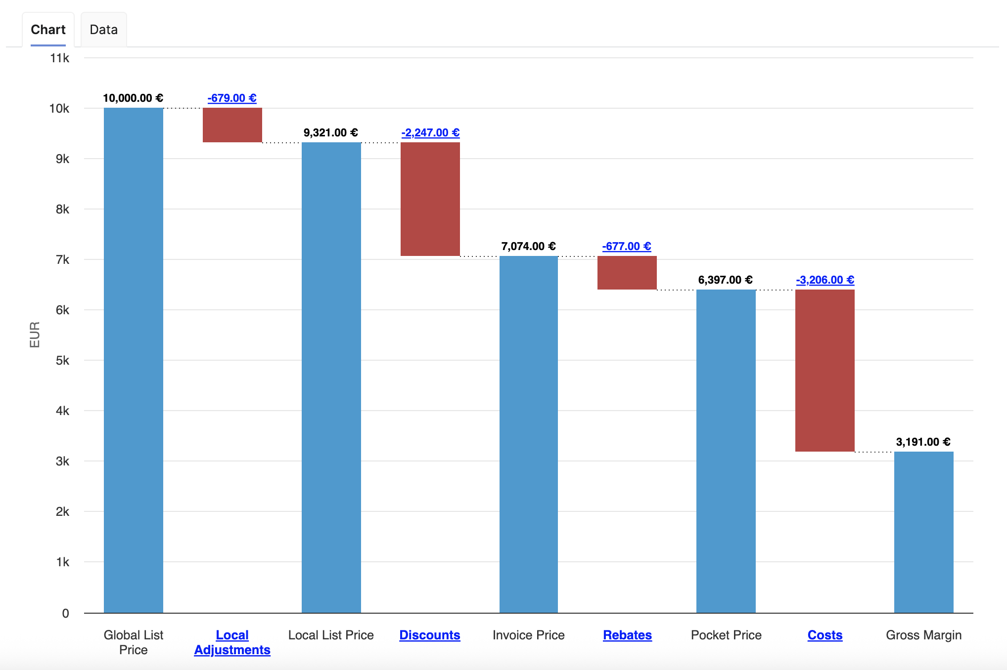
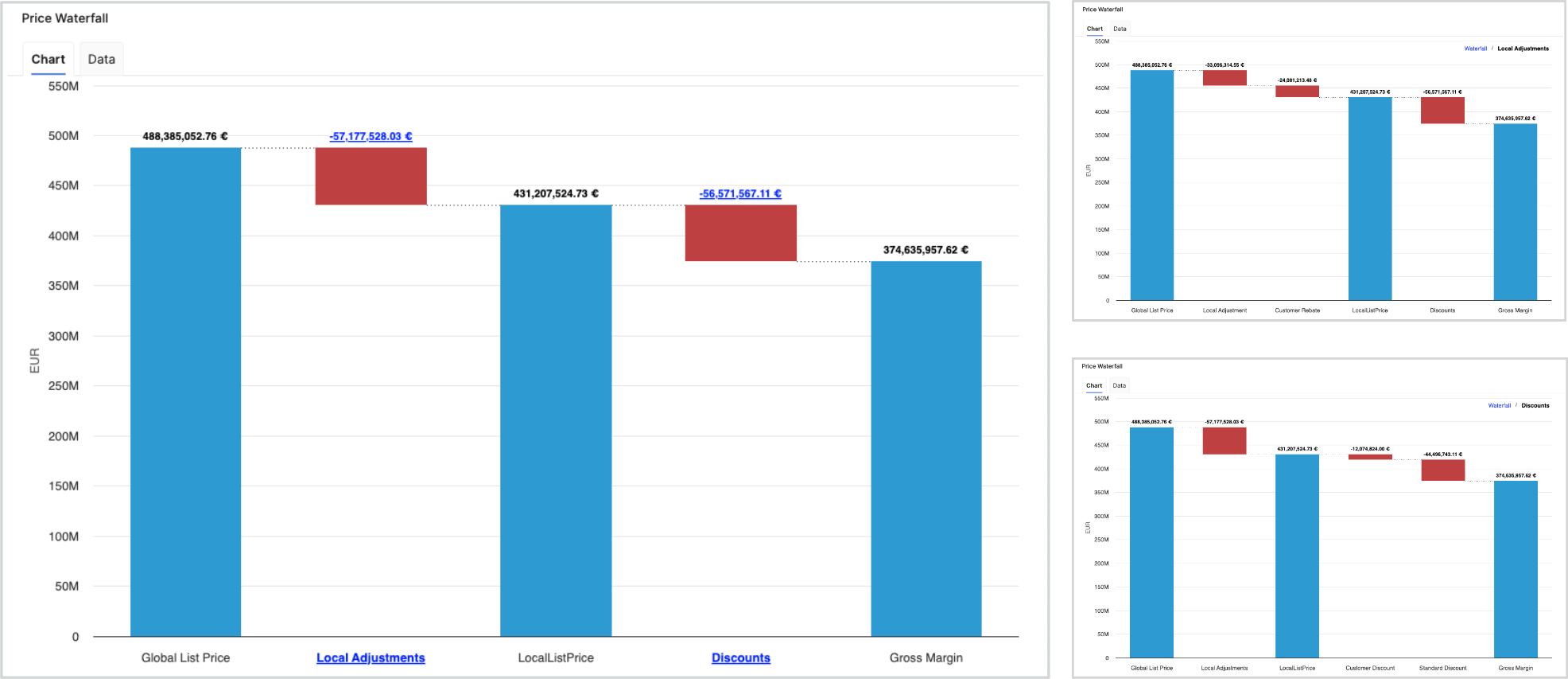
Price Waterfall
The Price Waterfall chart presents a standardized price waterfall analysis, enabling users to understand the impact of a sequence of intermediate positive and negative values on an initial value. The Price Waterfall chart provides a comprehensive overview of how initial pricing is adjusted by various factors, ultimately influencing what a customer actually pays. This visualization is essential for assessing pricing strategies and understanding profit dynamics. The columns within the chart are color-coded to effectively distinguish between positive and negative values.
Example Price Waterfall Setup
The following elements and values used in this example Price Waterfall setup are provided for illustration and recommendation purposes only and are not part of the standard solution by default. Each user is responsible for configuring their own Price Waterfall to match their specific use case, business logic, and data model. Before using this example in a production environment, the setup and all underlying assumptions must be reviewed, adapted, and validated against the user’s own data and requirements.
The columns present the following total values:
-
Global List Price
-
Local Adjustments
-
Local List Price
-
Discounts
-
Invoice Price
-
Rebates
-
Pocket Price (Realized)
-
Costs
-
Gross Margin
The chart outlines several key components that contribute to the transformation from the initial list price to the net price realized by the company. These components, identified as pillars, include:
-
Global List Price – The original price proposed to customers prior to any adjustments.
-
Local Adjustments – These adjustments address foreign exchange variations and local market conditions that can affect pricing.
-
Local List Price – Reflects the price after accounting for local adjustments.
-
On-Invoice Discounts – Discounts applied directly on customer invoices, affecting the final price paid.
-
Rebates – Financial incentives provided post-purchase to encourage customer loyalty or volume purchases.
-
Pocket Price (Realized Price) – This is the actual amount received after all adjustments, representing revenue that contributes to gross margin calculations.
-
Costs and Gross Margin – The chart also details associated costs, allowing for an examination of gross margin following all discounts and adjustments.
For more information see Price Waterfall Components.
To refine the data presented in the chart, users can apply several filters:
-
Customer(s) (Filter Definition)
-
Product(s) (Filter Definition)
-
Review Period (Filter Definition)
-
General Filter (Filter Definition)
Additionally, the chart features data labels and a data tab, along with the capability to drill down to one level deeper within the waterfall.
Model Information Portlet
Model information portlet is located at the bottom of the dashboard. Portlet shows which Insights Dashboards Configuration model object the dashboard is currently using as its data source. The portlet displays the name of the model (not the label, which can be empty) and provides a direct link to open the model. This information is read-only and is designed purely for transparency: users can quickly verify the model behind the dashboard data and, if needed, navigate to the model definition for further analysis or to coordinate changes with administrators.
See Also: