The Customers Overview Dashboard provides a comprehensive view of customer data, enabling businesses to analyze key performance metrics effectively. The dashboard helps in identifying top-performing segments and also facilitates targeted performance reviews for optimized business outcomes.
Set Up Data and Filters
Data Filter
|
Input |
Description |
|---|---|
|
Review Period |
Filters data for the analysis according to the given time range. The Review Period filter defaults to the previous 12 months of data. |
|
Customer Hierarchy |
Filters data for the customer industry. |
|
Customer Rank |
1 - 10 (By default)
|
|
Product Hierarchy |
Filters data for the product industry. |
|
General Filter |
Allows you to set up a generic transaction data filter. For example: display only data from Europe, or Asia. |
Note there is a known limitation for the Product/Customer attribute dashboard filters. For more information see Limitations (Insights Dashboards) | Filter Attributes Outside Datamart Tables Scope.
More Options
|
Input |
Options |
Description |
|---|---|---|
|
Time Period |
|
Period Type allows to set the Review Period. |
|
Customer Category |
|
Defines aggregation level for Opportunity.
|
Analyze Results
The dashboard provides the following summaries.
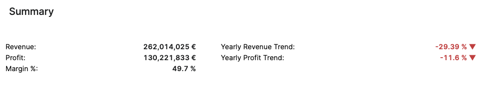
Summary
The Summary table provides an effective overview for business monitoring and strategic decision‑making by showing key revenue and profit metrics based on your selected filters. The default view of the Summary table displays aggregated data for all customers. You can apply filters to focus on a particular customer, adjust the Review Period, and more:
-
Review Period (Filter Definition)
-
Customer Hierarchy (Filter Definition)
-
Customer Rank (Filter Definition)
-
Product Hierarchy (Filter Definition)
-
General Filter (Filter Definition)
The Summary table presents the following key figures for the currently selected customer:
-
Revenue (Field Definition)
-
Profit (Field Definition)
-
Margin % (Field Definition)
-
Yearly Revenue Trend (Field Definition)
-
Yearly Profit Trend (Field Definition)
The data structure is based on aggregated transactions. All trends are calculated on a yearly basis. The time period is defined by the Review Period filter.
See Also:
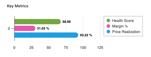
Key Metrics
The Key Metrics chart serves as a focused, comparative visualization of three performance indicators. This chart enables users to monitor the overall financial and commercial health of a selected customer or customer segment over a specified review period. The chart is presented as a multi-bar visualization, where each bar represents one key metric, all plotted on a common, normalized axis ranging from 0 to 100%. The Key Metrics chart displays the following metrics:
-
Health Score (Field Definition)
-
Margin % (Field Definition)
-
Price Realization (Field Definition)
You can apply filters to refine the data. You can filter for a specific customer, set the Review Period, and select other options:
-
Review Period (Filter Definition)
-
Customer Hierarchy (Filter Definition)
-
Customer Rank (Filter Definition)
-
Product Hierarchy (Filter Definition)
-
General Filter (Filter Definition)
See Also:
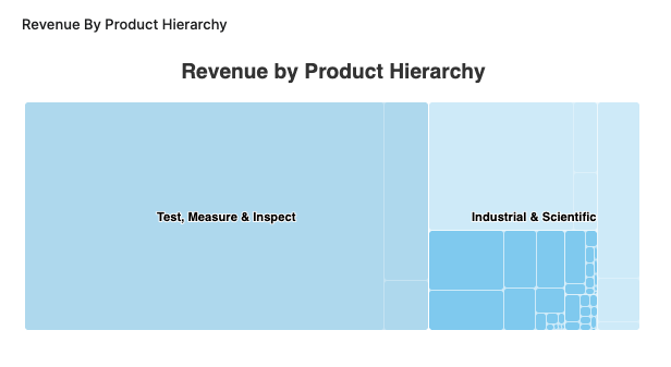
Revenue By Product Hierarchy
The Revenue By Product Hierarchy helps users to analyze revenue distribution across all levels of their product hierarchy within a selected period.
-
The chart provides insight into the revenue performance of each product hierarchy level, helping users to:
-
Identify top-performing segments.
-
Spot underperforming product groups.
-
Understand the contribution of each hierarchy level to overall revenue.
-
-
Drilldown capabilities allow users to progressively explore revenue figures from higher-level categories down to more granular levels, supporting root cause analysis and targeted performance reviews.
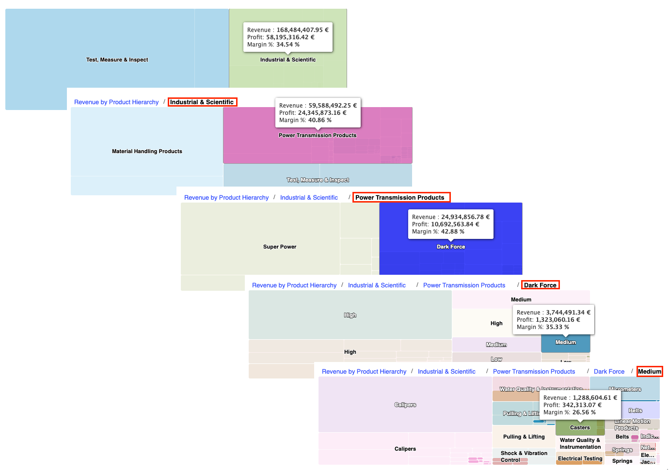
Revenue By Product Hierarchy Chart Drilldown Options -
Supplemental metrics such as profit and margin percentage are accessible via tooltips, providing additional context on profitability and efficiency at each product hierarchy level.
See Also:
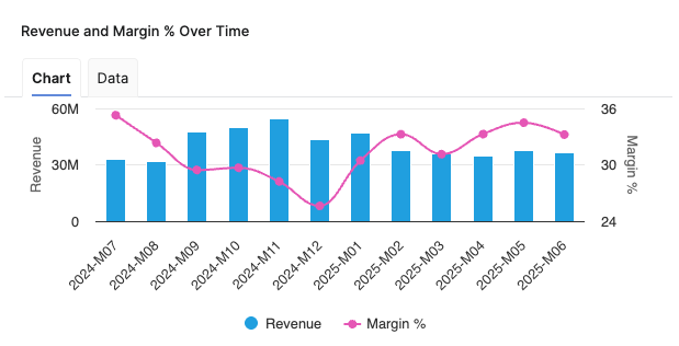
Revenue and Margin % Over Time
Helps you analyze the relationship between Revenue and Margin % in the aggregated time (month).
-
X-axis displays the time period aggregation as defined by the Time Period input.
-
Left hand side Y-axis shows the Revenue scale.
-
Right hand side Y-axis shows the Margin % scale.
See Also:
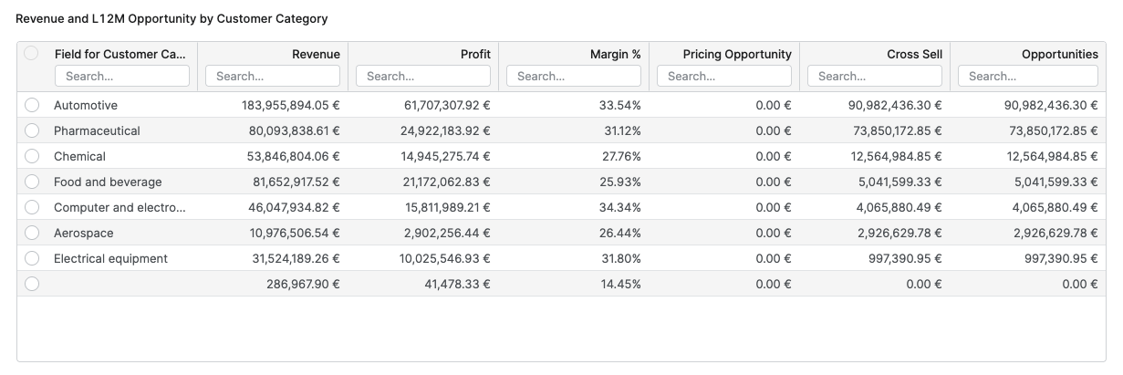
Revenue and L12M Opportunity by Customer Category
The Revenue and L12M Opportunity by Customer Category table provides users with a comparative overview of financial performance and sales opportunities across different customer categories.
The table allows to analyze and compare total revenue, profit, margin percentage, and various sales opportunities, such as pricing initiatives and cross-sell potential for each customer category. Information is grouped by customer category, which corresponds to the highest level of the customer hierarchy as defined in the dashboard configuration.
The columns in this table are as follows:
-
Customer Category – Indicating the group or classification of customers.
-
Revenue – Total monetary value of sales attributed to each customer category, calculated as the sum of all revenues.
-
Profit – Total profit for each customer category, presented as sum of all profits.
-
Margin % – The profitability ratio for each category, derived from total profit divided by total revenue.
-
Pricing Opportunity – The sum of all pricing improvement opportunities available within each category.
-
Cross Sell – The total potential additional revenue through cross-selling.
-
Opportunities – Combined value of Pricing Opportunity and Cross Sell for each customer category.
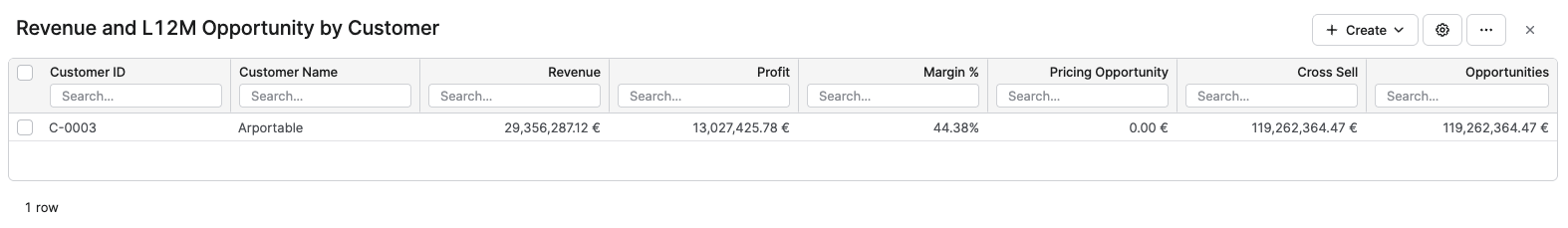
Revenue and L12M Opportunity by Customer
The Revenue and L12M Opportunity by Customer table provides a detailed view of revenue, profit, margin, and sales opportunities for each individual customer within the currently selected filters. It helps you identify high‑value customers, evaluate their profitability, and prioritize pricing and cross‑sell initiatives at customer level.
The columns in this table are as follows:
-
Customer ID – Unique identifier of the customer, used as the primary key in the underlying data structures.
-
Customer Name – Readable customer label that is shown in the application instead of the technical ID wherever available.
-
Revenue – Total monetary value of sales attributed to the customer in the selected review period, calculated as the sum of all revenues for that customer.
-
Profit – Total profit generated by the customer in the selected review period, shown as the sum of all profits for that customer.
-
Margin % – Profitability ratio for the customer, calculated as total Profit divided by total Revenue, expressed as a percentage.
-
Pricing Opportunity – Sum of all pricing improvement opportunities for the customer over the last 12 months.
-
Cross Sell – Total potential additional revenue from selling complementary or additional products to the same customer over the last 12 months.
-
Opportunities – Combined value of Pricing Opportunity and Cross Sell for the particular customer, representing the total monetary upside identified for that customer.
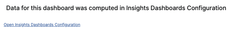
Model Information Portlet
Model information portlet is located at the bottom of the dashboard. Portlet shows which Insights Dashboards Configuration model object the dashboard is currently using as its data source. The portlet displays the name of the model (not the label, which can be empty) and provides a direct link to open the model. This information is read-only and is designed purely for transparency: users can quickly verify the model behind the dashboard data and, if needed, navigate to the model definition for further analysis or to coordinate changes with administrators.
See Also:
See Also