
The Gauge chart is a convenient way to show, for example, how good your quote is compared to the target price. It looks like this:
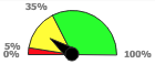
It can be used in Quotes, Price Lists, and many other places. To use it, simply have your calculation logic element return the object ResultGauge returned from calling api.newGauge().
Groovy
def g = api.newGauge()
g.setMin(0)
g.setMax(100)
g.setValue(20)
g.addSector(5,"#FF0000")
g.addSector(35,"#FFFF00")
g.addSector(null,"#00FF00")

quoteProcessor.addOrUpdateOutput(
  "ROOT",
  ["resultName": "Gauge",
   "resultLabel": "Gaugeeee",
   "resultType": "GAUGE",
   "result" : g ]
)
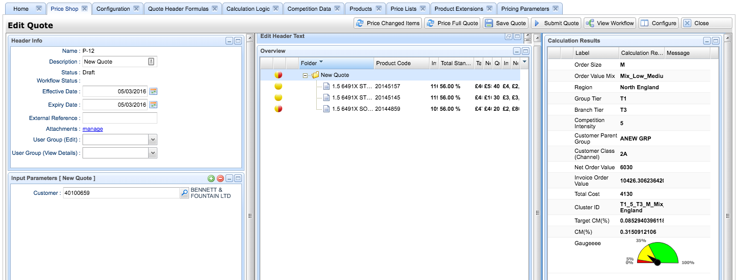
Note: If you add the gauge to Overview as a column, a numerical value will be displayed here, not a graphical gauge as in Calculation Results.