Check out the main differences in a brief overview here.
This section summarizes the differences between the old Ember version and the new React version, introduced as a new UI for Quotes and Rebate Agreements (in version 8.0 Godfather) and for Agreements & Promotions (in version 9.0 Hurricane).
-
You can determine which version users will use by enabling/disabling React. Set the
useReactForfeature flags to either true or false. -
You can let users choose which version to use by enabling the Try New Quoting / Rebates / Agreements & Promotions button (
showTryNewReactVersionButtonfeature flag). This button will be displayed in the Ember version. Users who switch to React using this button will be able to return to Ember via the Switch Back to Old Version menu option.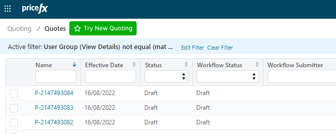
Application UI
General
-
Document is by default auto-saved when it is created; the Save button can be enabled (for Quotes in version 12.0, for Rebate Agreements and Agreements & Promotions in version 13.0).
-
The “Create New Revision” action opens the new revision straight away, no need to navigate to the new revision through a notification link or listing.
-
The Refresh button has been removed, as it duplicates the browser’s refresh function.
-
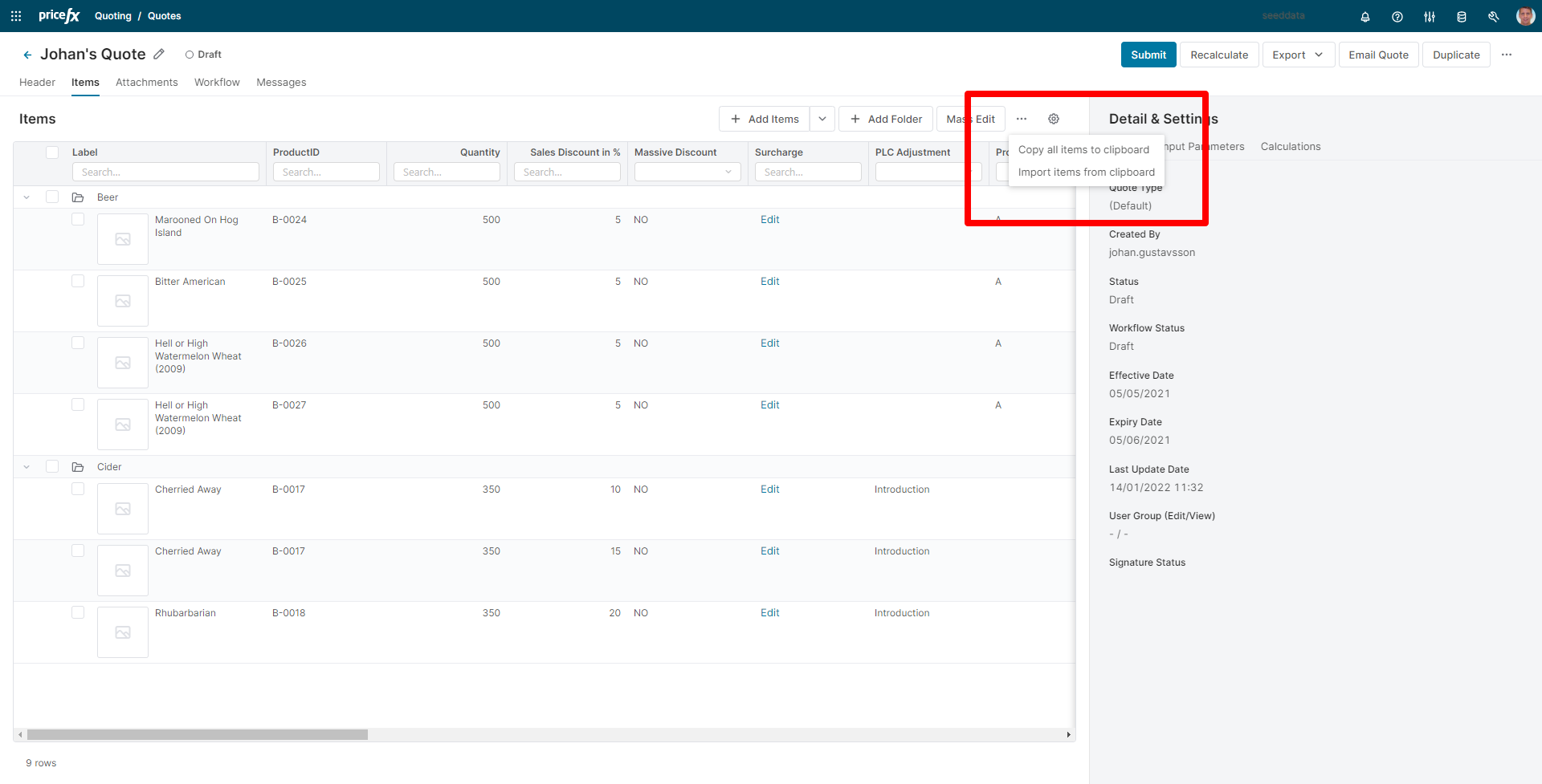
Import/Export is split into two actions:
-
Copy all items to clipboard (without a dialog window)
-
Import items from clipboard (with a dialog window)
-
Labels for "Export PDF", "Export Word" and "Export Excel" can be modified independently in the Internationalization section. (In React they are dependent on the value of the key "sfdc_export" which stands for the Export button. Whatever value this key has, it is propagated to the other three export options and the type/format is added automatically.)
-
There are no default preferences for the result matrixes. You need to use setPreferenceName().
-
Header
-
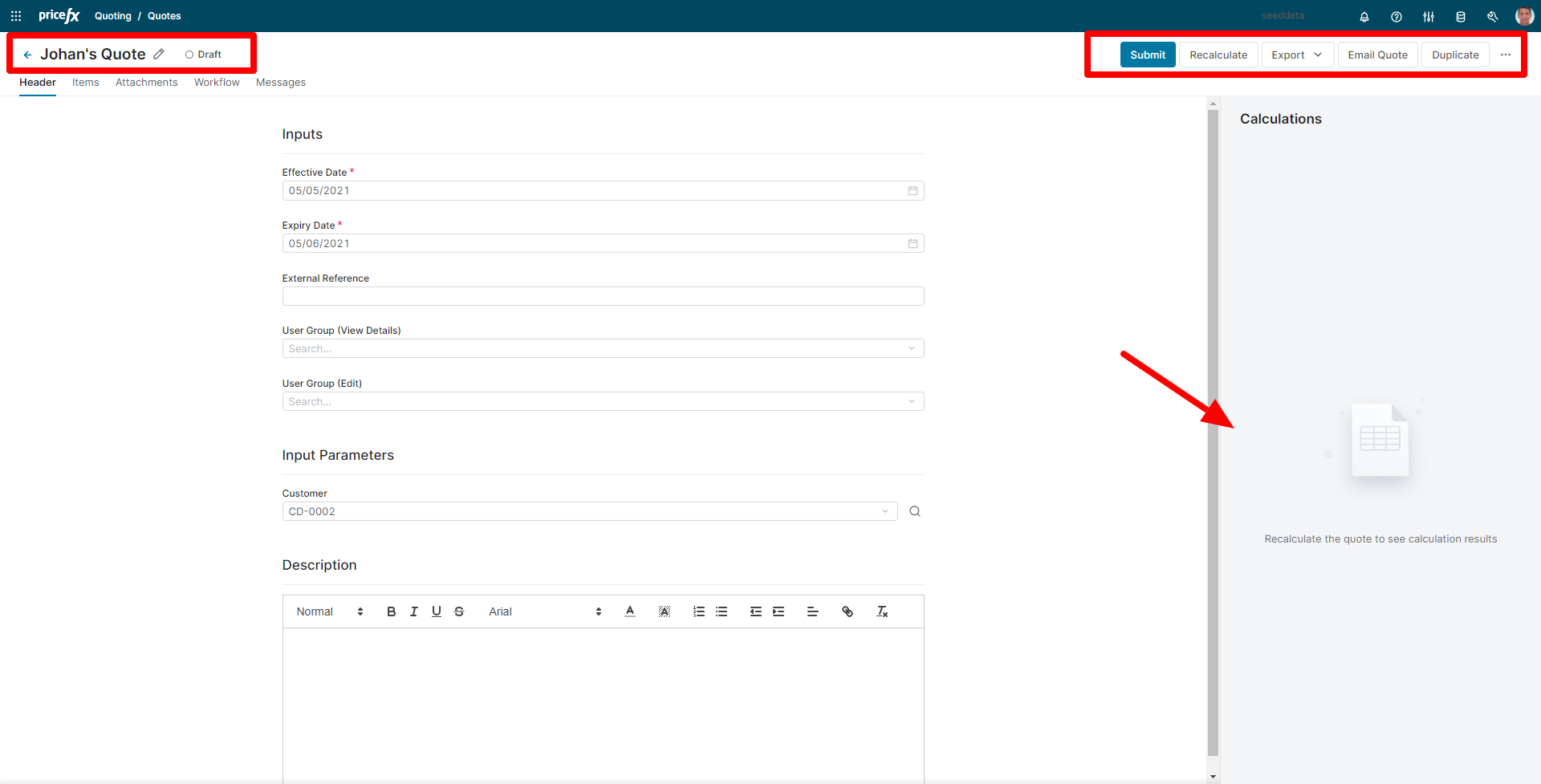
New header component with an updated design and support for new header features:
-
Document title is now editable in the header.
-
The current document status and the workflow status are displayed next to the document title.
-
-
The main action buttons are ordered from left to right, and the layout is responsive to the screen size – buttons will move under a drop-down menu as the space shrinks.
-
Header is fixed when scrolling through tables and forms to ensure that the main action buttons are always visible.
-
A new right-hand side panel displays header outputs and results.
Items
Table
-
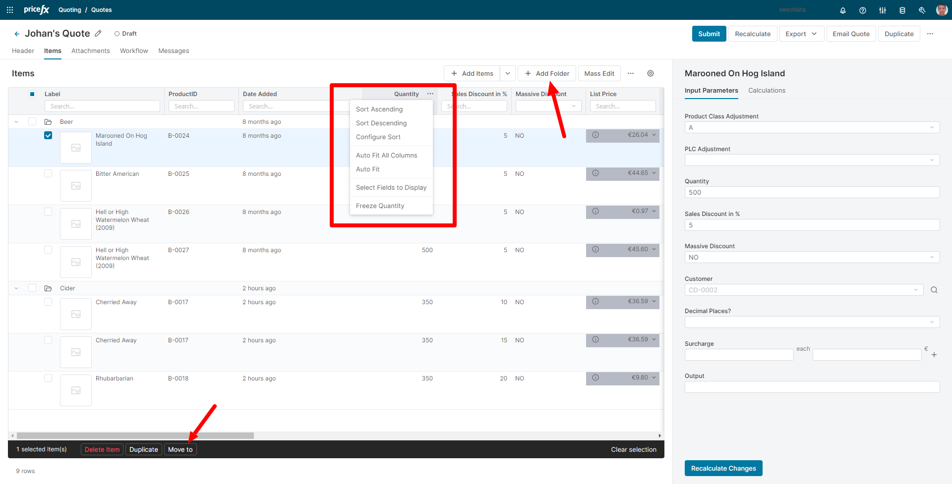
One unified table view that combines the features of the old Tree View and Simple Table View.
-
Selection pattern changed (Items and folders are individually selected, but actions applied to the folder are applied also to the content of the folder, e.g., deletion, duplication).
-
New system column “Date Added” that can sort the items so that the newest ones are always displayed on top of the list.
-
Ability to add and manage folder structure in the table:
-
Move item(s) to a folder through item action.
-
Double-click for in-line editing of folder names.
-
Copy folder + folder content.
-
-
Fully fledged line item table with new features (most of them already available in our other tables application-wide):
-
Simple filters and quick operators
-
Multi-level sorting
-
Resizable columns supported by preferences
-
Auto-fit columns
-
Column freezing
-
Keyboard navigation (from version 13.0)
-
-
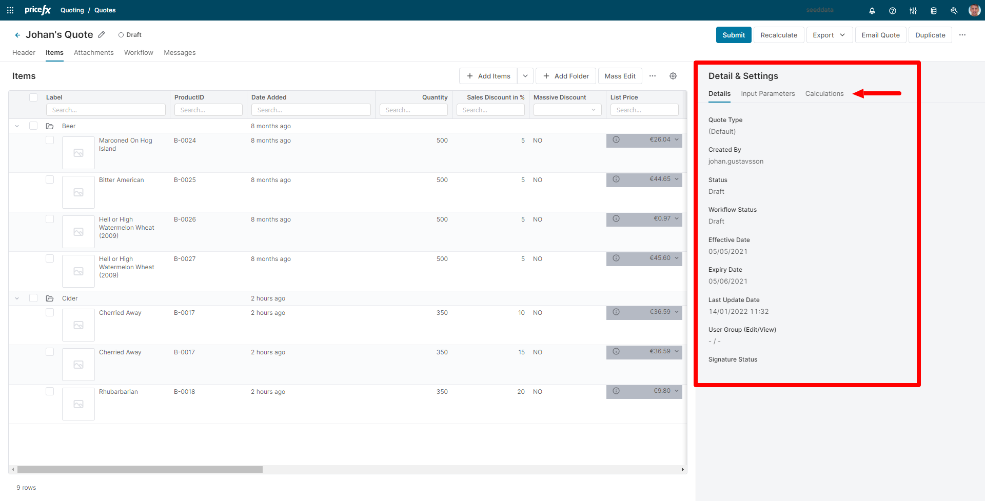
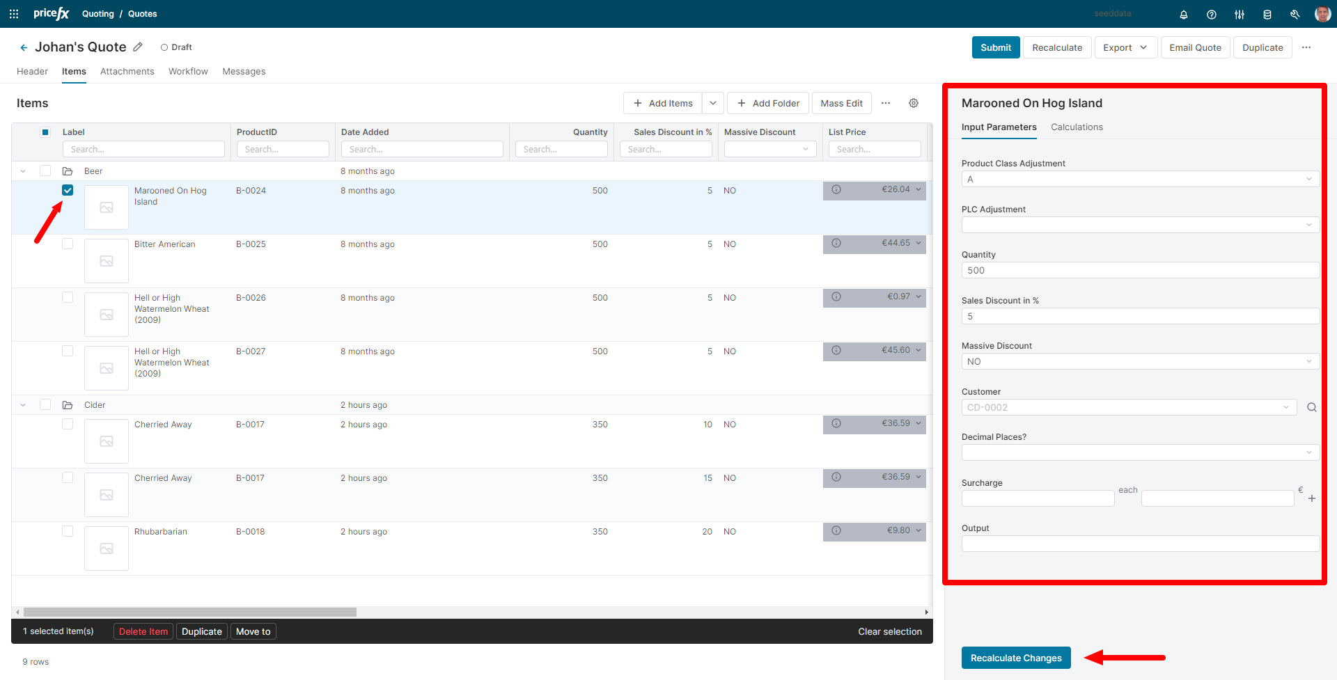
Right-hand Side Panel
-
A new sider component with multiple tabs for displaying content such as document details, inputs & calculation results:
-
Inherited values from header or folder inputs are displayed as a placeholder text (if multiple items are selected the placeholder value only displays if all the items have the same inherited value).
-
If no item is selected, the banner is displaying header information. Once an item is selected, the banner is displaying information in the context of the selected line item.
-
Contextual “Recalculate” button available at line item inputs for quick recalculation of changes performed on the line item (The action performs recalculation of any changes since last recalculation but doesn’t perform a full document recalculation).
-
Ability to edit multiple items with shared inputs at the same time.
-
Possibility to hide or place the panel to the bottom of the screen and allow users to switch between these two positions.
-
Tabs displayed change contextually depending on which actions are performed:
-
Header recalculation unselects all items and shows header outputs.
-
Line item recalculation displays line item outputs.
-
-
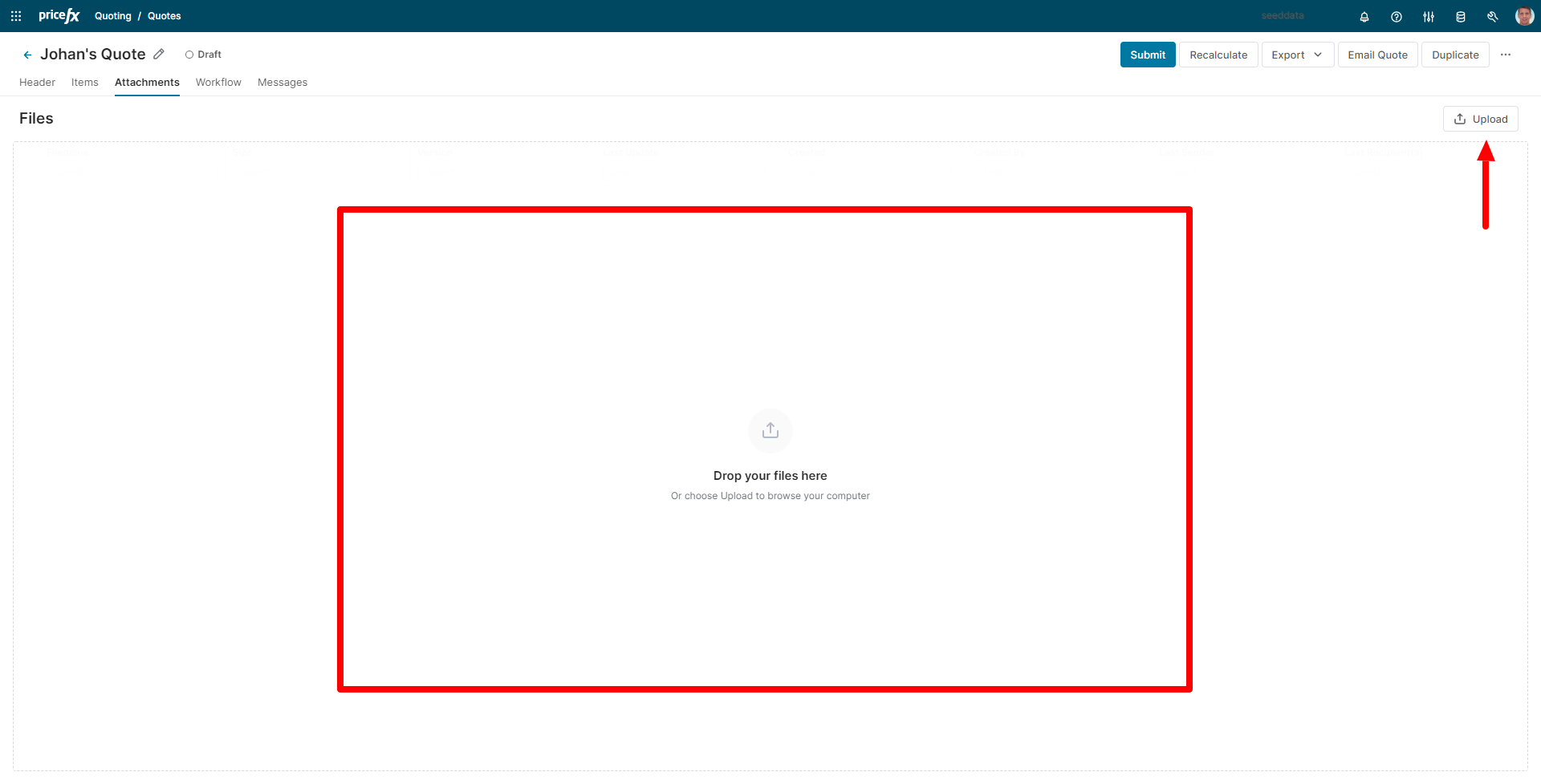
Attachments
-
You can now add attachments by drag & drop into the whole attachment area.
-
We have also added an “Upload” to allow browsing for files if preferred.
-
List of attachments is now displayed in the new table component.
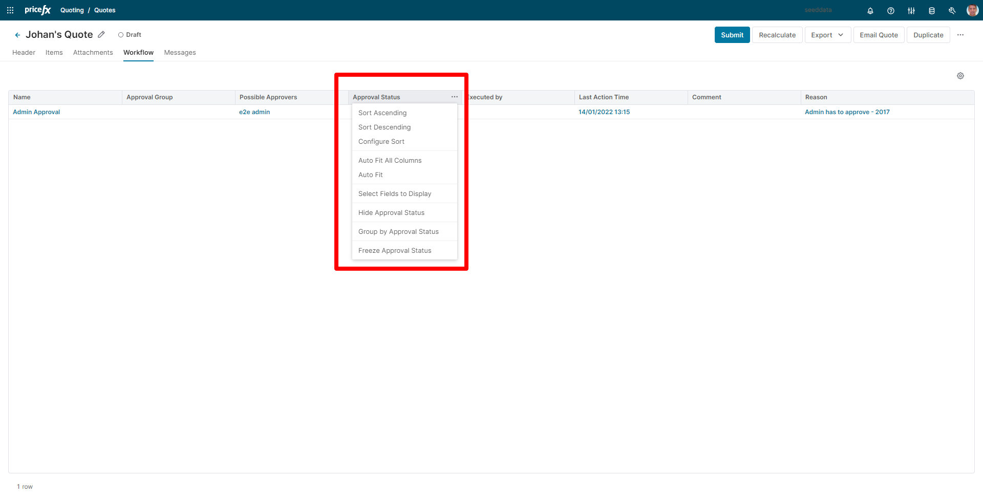
Workflow
-
List of workflow steps is now displayed in the new table component.
Workflow History
-
List of workflow history items is now displayed in the new table component.
Dynamic Tabs
-
Ability to display multiple dashboards in tabs.
-
Additional support for dynamic tabs, including:
-
Disabling tabs
-
Hiding tabs
-
Setting tabs as exclusive for specific user groups
-
Changing order of tabs
-
Backend
New Backend API
-
The new backend API is better performing and responsive:
-
The prior version was always sending the entire document to the backend, while the new backend API sends only the part which is needed under the given circumstances.
-
There is also a new concept of performing actions asynchronously when long waiting time for action execution is detected.
The asynchronous actions are performed based on the number of line items and are set in the Configuration page.
-
Feature Flags
Certain Feature Flags are specific to Ember and no longer applicable in React. The following flags have not been implemented for React:
-
contractHeaderConfiguration.showContractHeader
-
rebateAgreementHeaderConfiguration.showRebateAgreementHeader
-
expandWorkflowComments
-
enableDebug
-
quoteSaveBeforeSubmit
-
contractSaveBeforeSubmit
-
contractButtonsConfiguration.showSaveButton
-
contractButtonsConfiguration.showWorkflowButton
-
quoteButtonsConfiguration.showRecalculateChanges
-
quoteButtonsConfiguration.showSaveButton
-
quoteButtonsConfiguration.showWorkflowButton
-
quoteHeaderConfiguration.showQuoteHeader
-
quotes.enableHighchartsThemeInEmber
-
quotes.omitTableLevel
-
quotes.showInputsView
-
quotes.showItemsViewOptions
-
quotes.showQuoteLabel
-
rebateAgreementSaveBeforeSubmit
-
rebateAgreement.showInputsView
-
rebateAgreement.showItemsViewOptions
-
rebateAgreement.showRebateAgreementLabel
-
rebateAgreementButtonsConfiguration.showSaveButton
-
rebateAgreementButtonsConfiguration.showWorkflowButton
-
keyTypingDebounceDelay.quickFilters
-
keyTypingDebounceDelay.lookup
-
serverAPIs.defaultRecordsLimit
-
serverConnectionChecker.intervalSecs
-
serverConnectionChecker.maxConsecutiveFailures
-
modulePrefix
-
rootURL
-
locationType
-
validateInputsOnSave
-
timeFormat
-
serverConnectionChecker.pingEndpoint
-
rebateAgreementItemInput.lookupField
-
rebateAgreementInput.disabled
-
rebateAgreementInput.lookupField
-
rebateAgreementInput.placeholder
-
rebateAgreementInput.searchButtonTip
-
customerInput.disabled
-
customerInput.lookupField
-
customerInput.placeholder
-
customerInput.searchButtonTip
-
productInput.automaticSelection
-
productInput.disabled
-
productInput.lookupField
-
productInput.placeholder
-
productInput.searchButtonTip
-
productSearchWithQuoteItems
-
productPickerPageLength
-
contractItemInput.lookupField
-
contracts.omitTableLevel
-
contracts.showContractLabel
-
contracts.showInputsView
-
contracts.showItemsViewOptions
-
showPerformanceWarningWhenOpeningTreeView
-
showTableView
-
tableView.provideTableView2
-
tableView.showConfiguratorsInLineItemDetail
-
tableView.showLineItemDetailsBelowTable
-
tableView.showOverridableFielsAtLineLevel
-
inputRules
-
configurator.autoRecalc
-
configurator.autoRecalcDelay
-
configurator.autoRecalcFeatureEditable
-
configurator.showUndoClearButtonsInlineConfigurator
-
dashboard.inputsOpened
-
moment.includeTimezone
-
notification.automaticallyCloseAllPopups
-
dateFormat
-
exportApplicationGlobal
-
showLineItemButtons