Address Customer Underperformance with Advanced Analytics
For this use case we are looking at a two step implementation approach of the Pricefx solution.
1. Solution Design
The solution considers the usage of the Customer Insights Accelerator package and the PriceFx modules used are Master Data, Analytics and Dashboards.
Design Summary
PriceFx Analytics allows a customer to get visibility into prices and margins. This module supports the definition and execution of the pricing strategy. It also allows for the analysis of actual and simulated pricing methods supporting the modeling of the enterprise performance and profitability. This module also provides for an easy and tight integration with MS-Excel.
The Customer Insights Package (CIP) is an accelerator built to leverage the Analytics capability. It allows you to set up all necessary data structures to be able to start quickly analyzing the sales data with minimum effort and limited requirements for the initial data set.
Core Concepts
The Customer Insights Accelerator is one of the pre-built solutions from PriceFx that provides a customer with a quicker path to the analysis of their pricing data. It allows the management teams to prevent margin leakages through a set of actionable analytics for sales and pricing. This enables the identification of customers at risk and the reasons behind.
The users can choose to analyze the performance of all customers, individual customers or customer groups using this accelerator. Also, product performance per customer can be performed.
The key KPI’s that are provided by the analysis are
-
Customer and Product health scores
-
Revenue, Margin and Volume trends
-
Pricing and Sales opportunities
These KPI’s are visualized through the dashboards made available by this accelerator. The key capabilities of these dashboards are as below:
-
Global Dashboard
-
Customer Detail Dashboard
-
Product Portfolio Dashboard
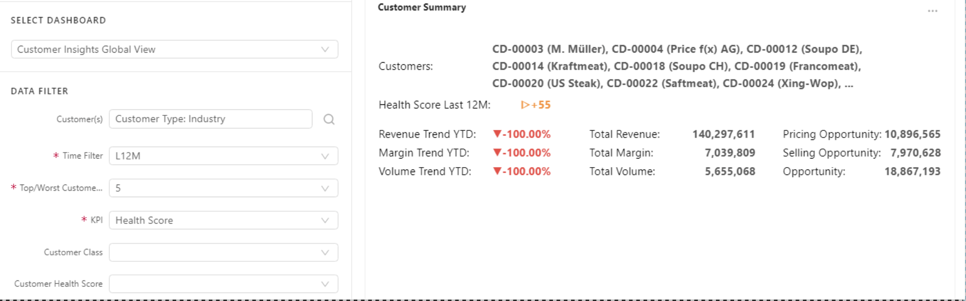
Global Dashboard
Provides customer performance via health score and revenue, pricing and selling opportunity, and overall customer summary.
Inputs:
-
Customer(s)
-
Time filter
-
Customer Rank – All, Top, Worst
-
Customer Rank Bucket – 5, 10, 50, 100
-
KPI – Revenue, Margin %, Volume, Health Score
-
Customer Class – Configurable and grouped to A,B,C etc
-
Customer Health Score – Excellent, Normal, Low, Problematic
-
Customer Base – Core or Long Tailed
The dashboard is comprised of the portlets below:
Global Dashboard Portlets
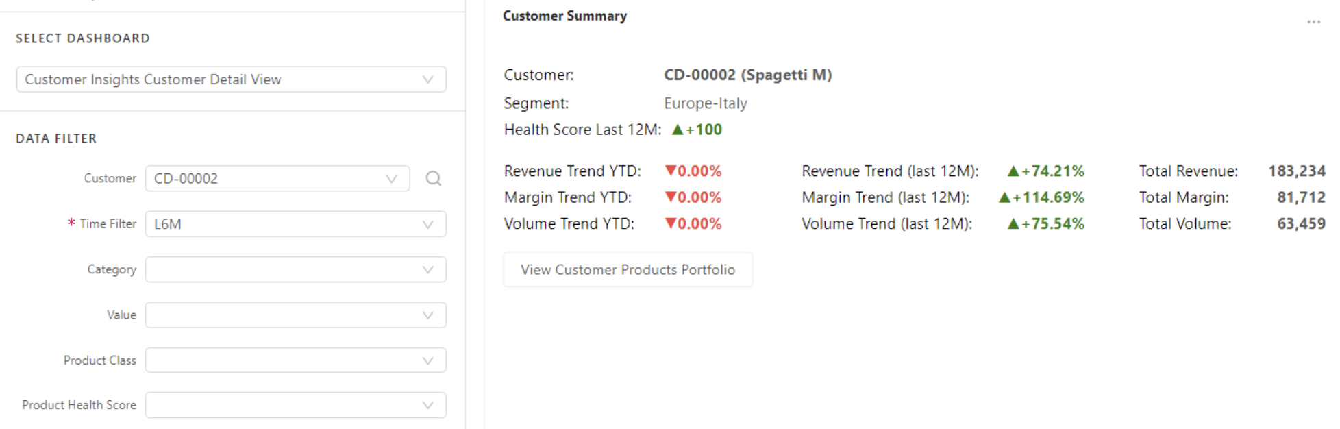
Customer summary
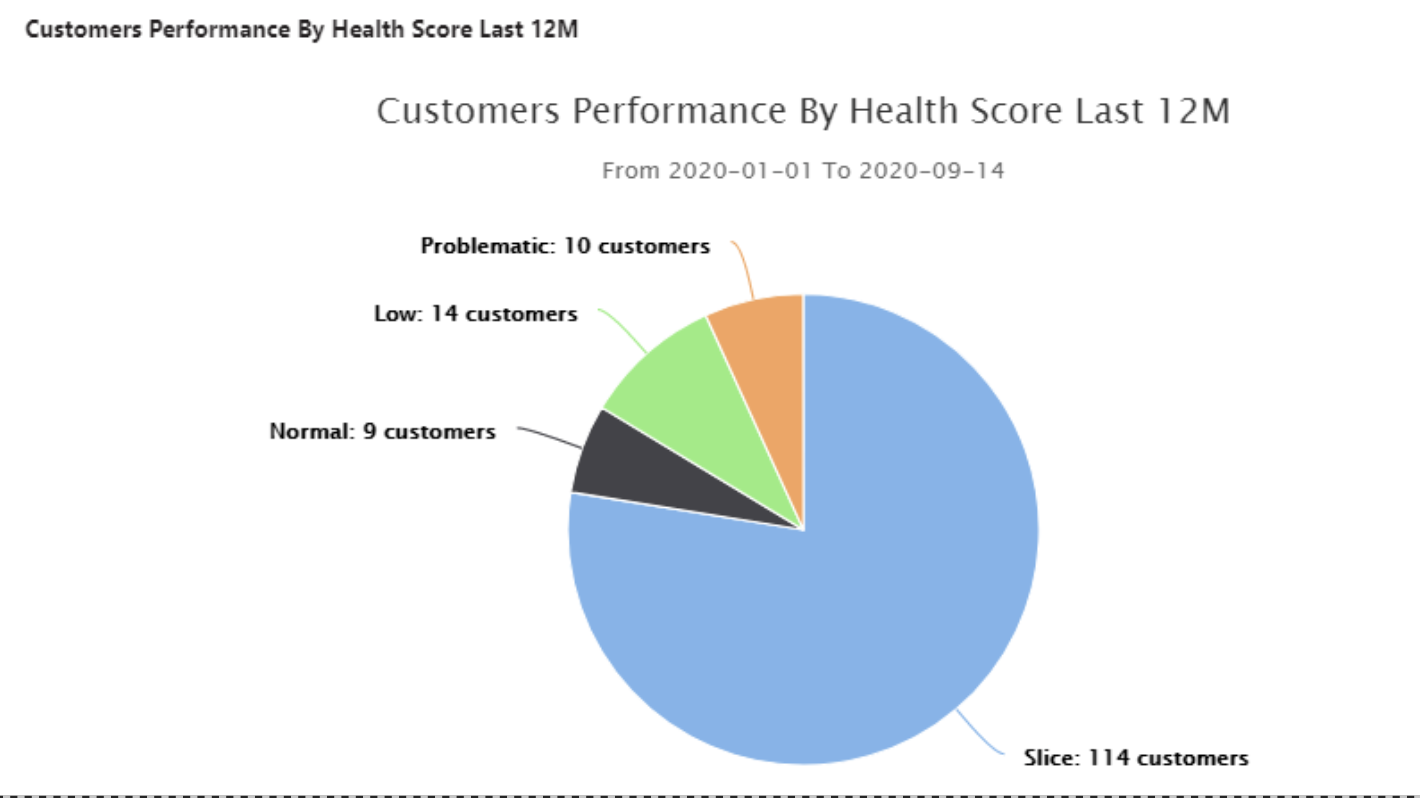
Customer Performance by health score last 12M
This portlet shows the relative sizes of the customer classification based on the health score in the last 12 months.
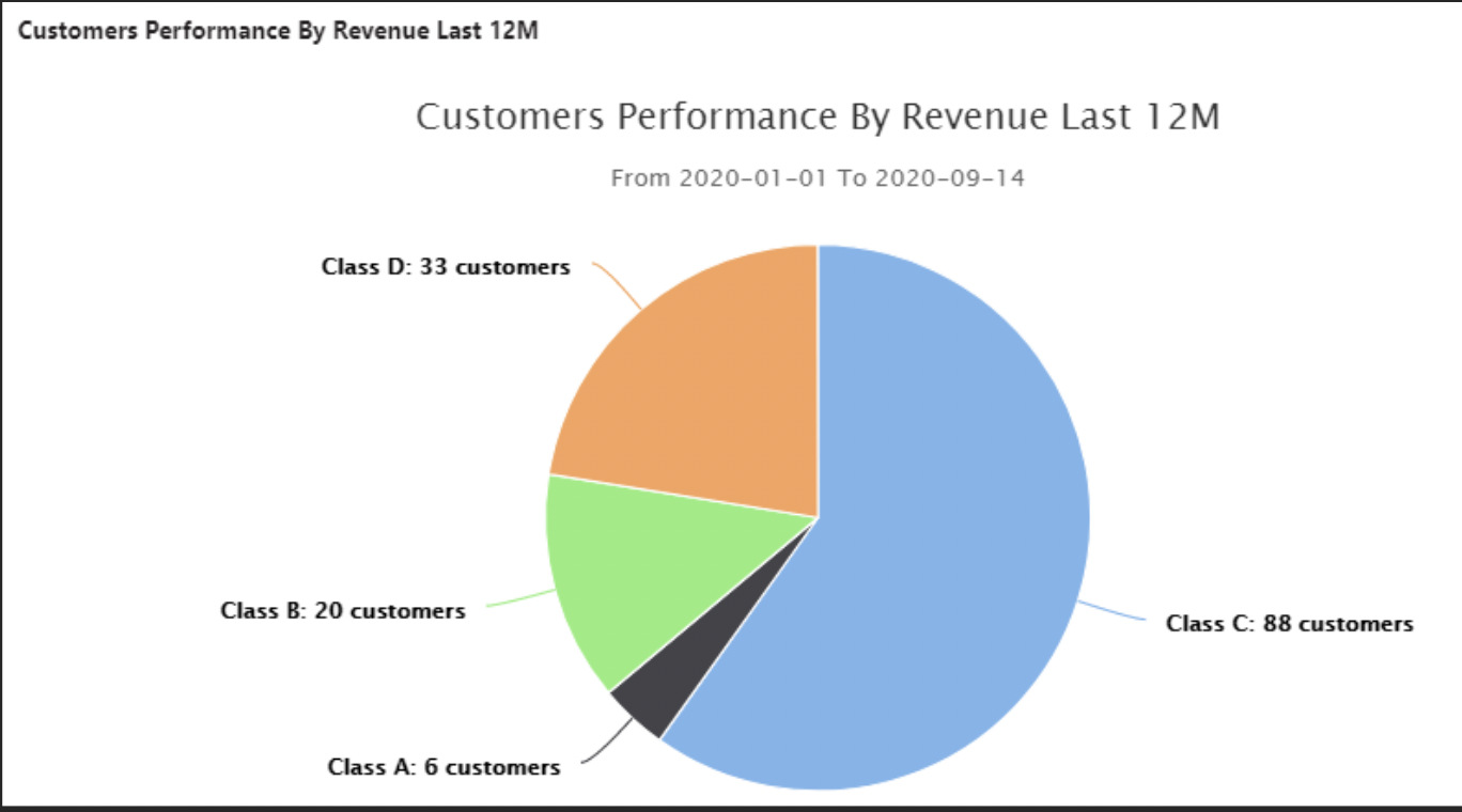
Customers Performance by Revenue Last 12M
This portlet shows the relative sizes of the customer classification based on revenue in the last 12 months.
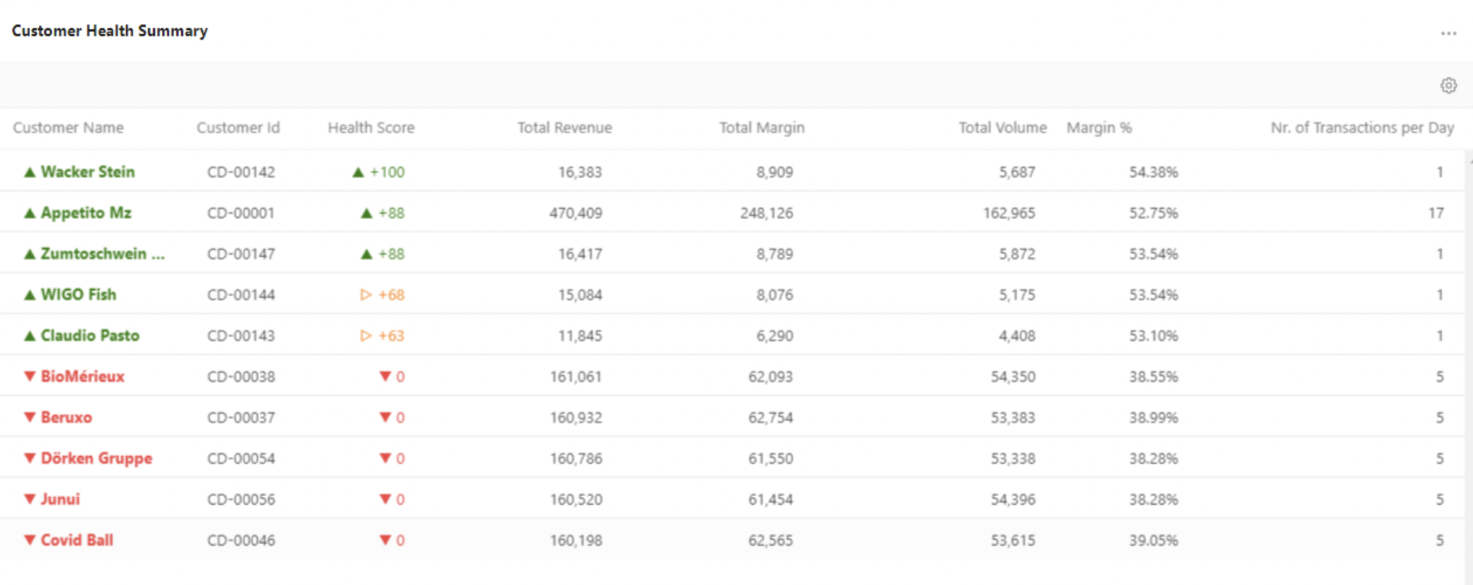
Customer Health Summary
This portlet shows the customer’s health calculated based on the difference between two periods. It shows a co-relation between Health score and revenue, gross margin, volume.
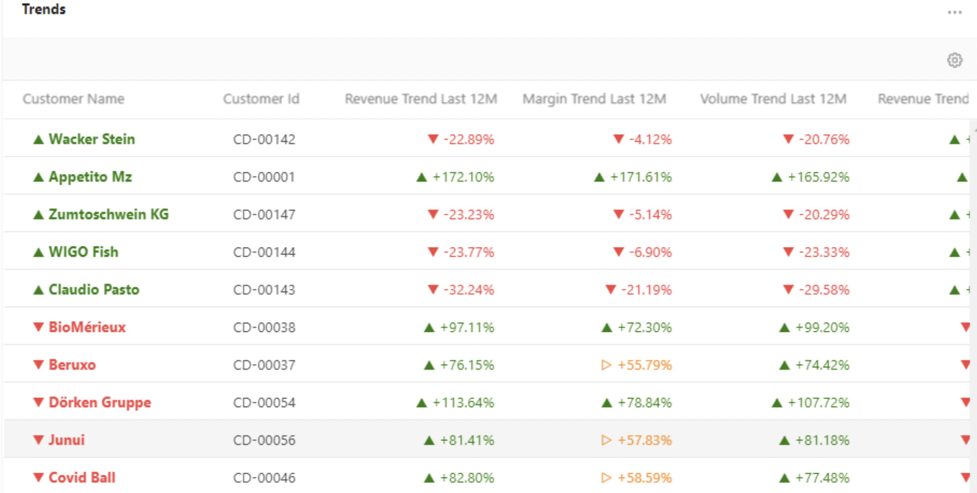
Trends
Pricing Opportunity
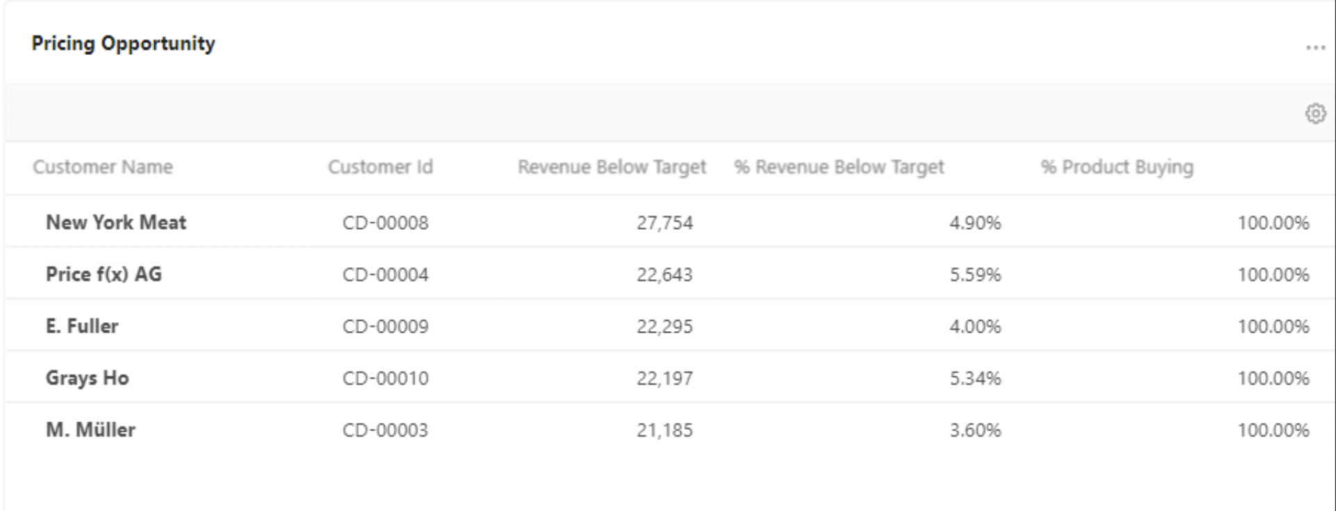
This portlet shows a list of customers who can be targeted to sell more products and more sales volume. The top of the list represents the highest opportunity, these customers are under the average point in the customers set. The bottom of the list represents the lowest opportunity.
Selling Opportunity
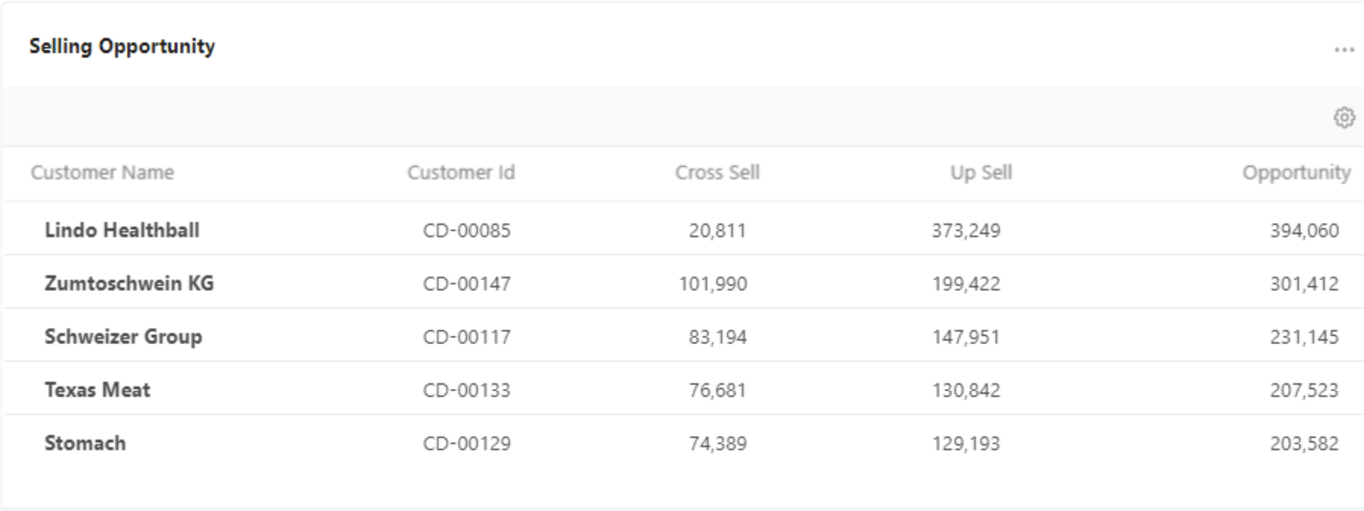
This portlet shows the total value which can be gained for products that the customer already bought and not bought in the given period.
Inactive Customers
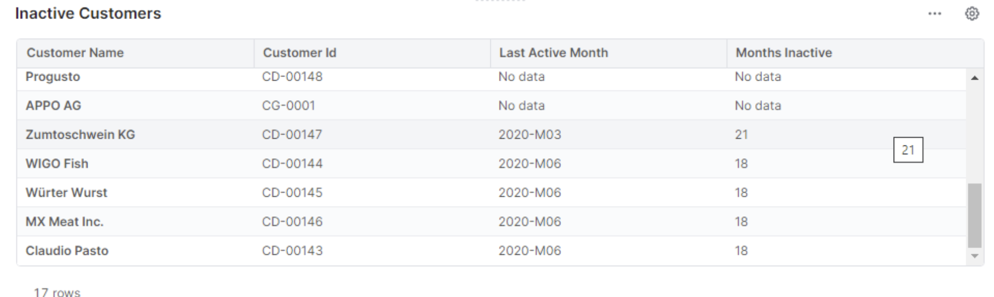
This portlet shows a list of “inactive” customers so that you can identify customers which are marked as active and for which there are no transactions in the chosen time period.
Customer Detail Dashboard
Provides a detailed customer view on revenue and margin, waterfall chart, high/low volume products, and revenue and margin trends.
Inputs:
-
Customer
-
Time filter
-
Category
-
Product Class
-
Product Health Score
-
Product Base
The dashboard is comprised of the portlets below:
Customer Detail Dashboard
Customer Summary
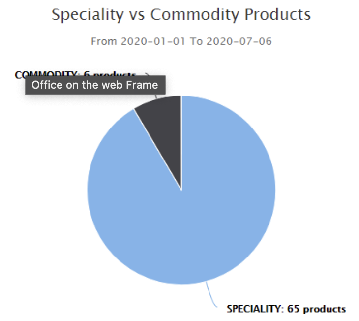
Specialty and Commodity Products
Shows the relative sizes of product classification based on their margin %. The specialty products are those that have a higher than defined margin % and commodity ones have lower.
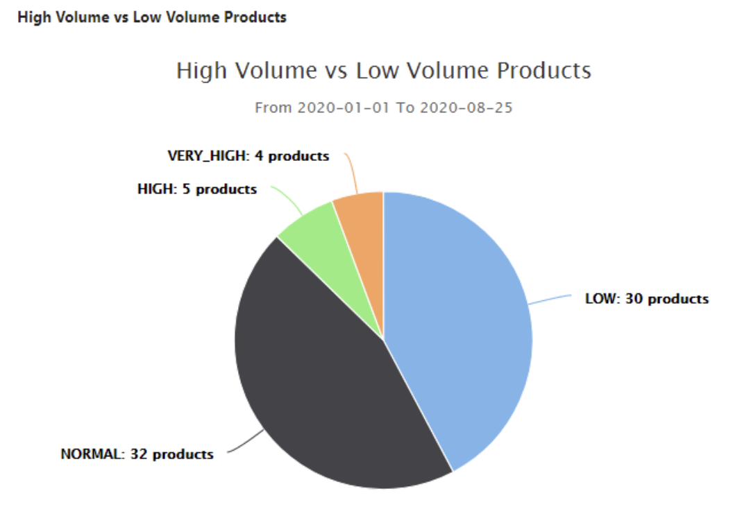
High and Low Volume Products
Shows relative sizes of product classification based on volume. The chart is based on Data Source Customer Insights Aggregated Data.
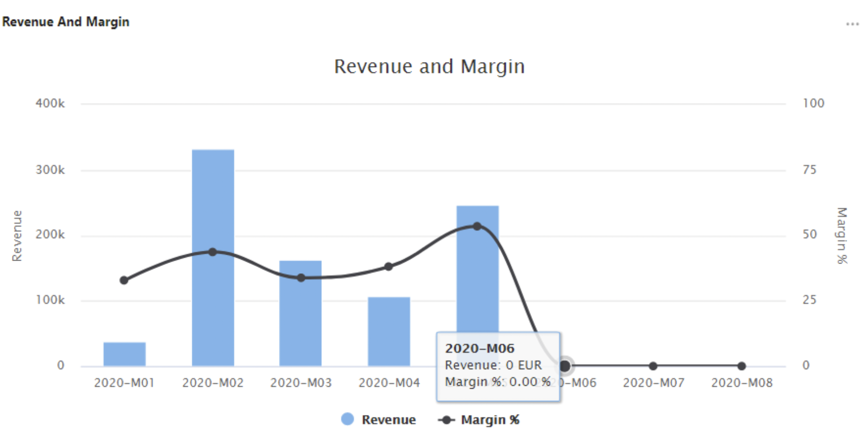
Revenue and Margin Charts
Shows Revenue and Margin values over several months in the given period. The chart is based on Data Source Customer Insights Aggregated Data.
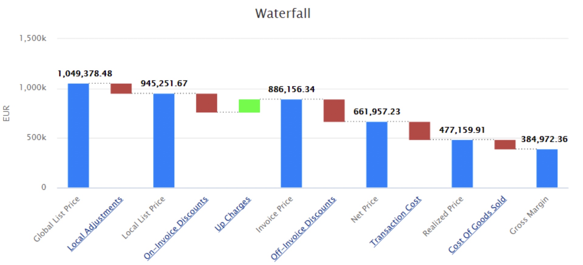
Waterfall Chart
Shows a running total profit as values are added or subtracted. This chart is based on Datamart.
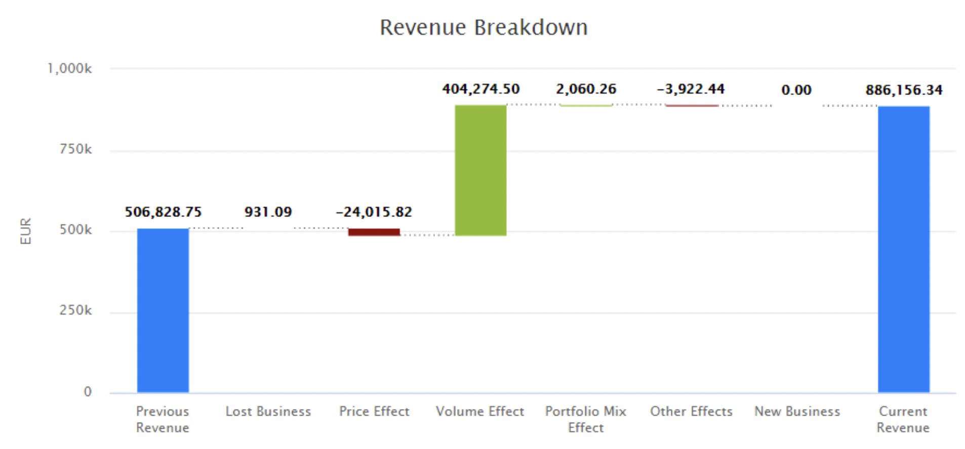
Revenue Breakdown Chart
Shows what the difference in revenue between two periods can be attributed to. It allows you to compare two years or quarters and optionally filter for only certain products and/or customers. The chart is based on Data Source Customer Insights Aggregated Data.
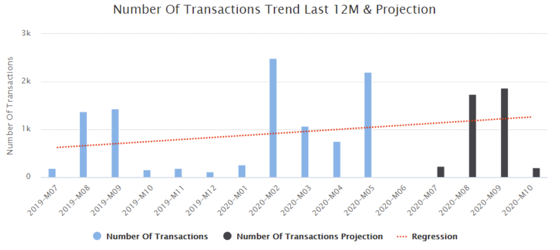
Number of Transactions in Last 12M and Projection
Bar & line chart shows the number of transactions for the last 12 months and estimation for the next 3 months. The current month is considered as a future month (as it has not ended yet). This chart is based on Datamart.
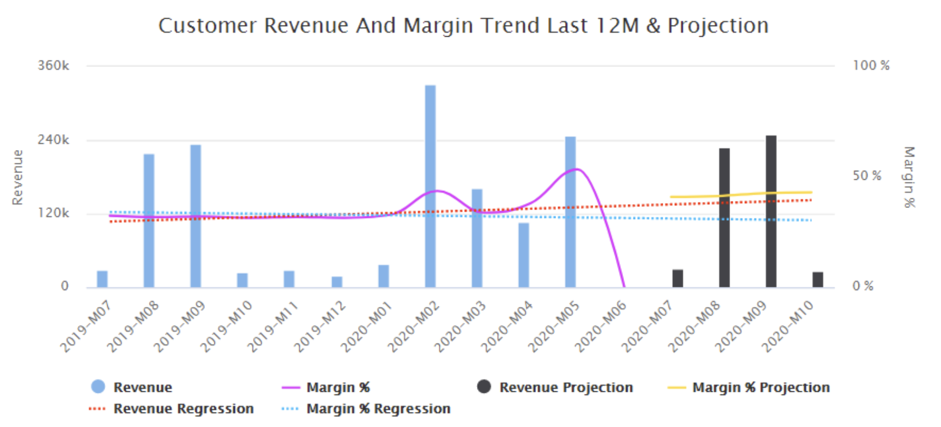
Customer Revenue and Margin Trend in Last 12M and Projection
Bar & line chart shows Revenue and Margin for the last 12 months and estimation for the next 3 months. The current month is considered as a future month (as it has not ended yet). This chart is based on Datamart.
Customer Products Portfolio Dashboard
Provides pricing opportunities by product type or attribute, identifies the top and bottom products.
Inputs:
-
Customer
-
Product Attribute
-
Time Filter
-
Product Rank
-
Product Rank Bucket
-
Product Class
-
Product Health Score
-
Product Base
The dashboard is comprised of the portlets below:
Customer Products Portfolio Dashboard
Customer Summary
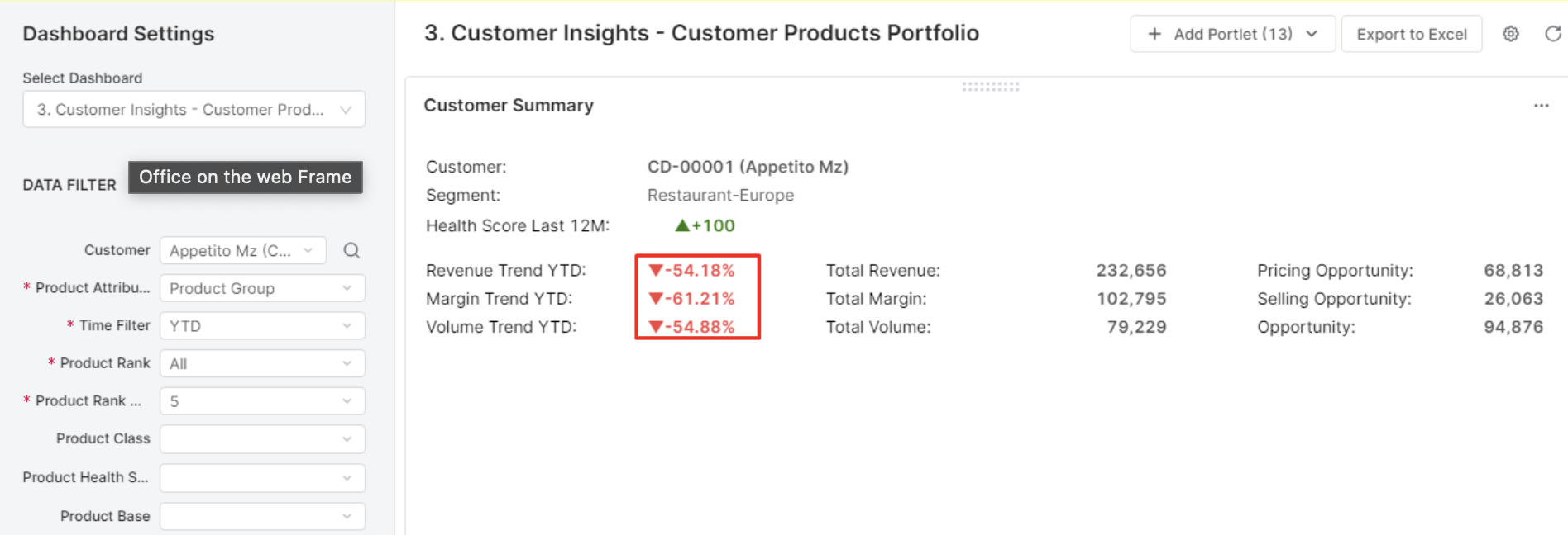
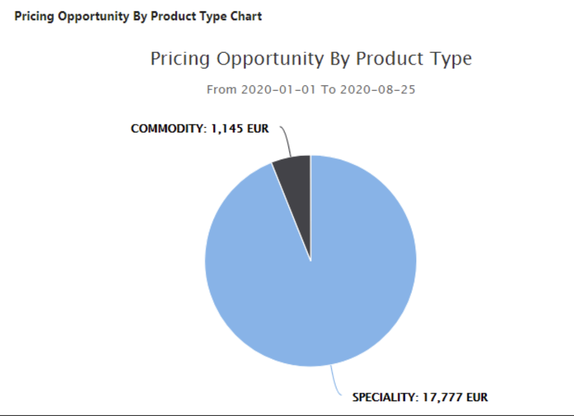
Pricing Opportunity by Product Type
Shows relative sizes of product classification based on the margin %.
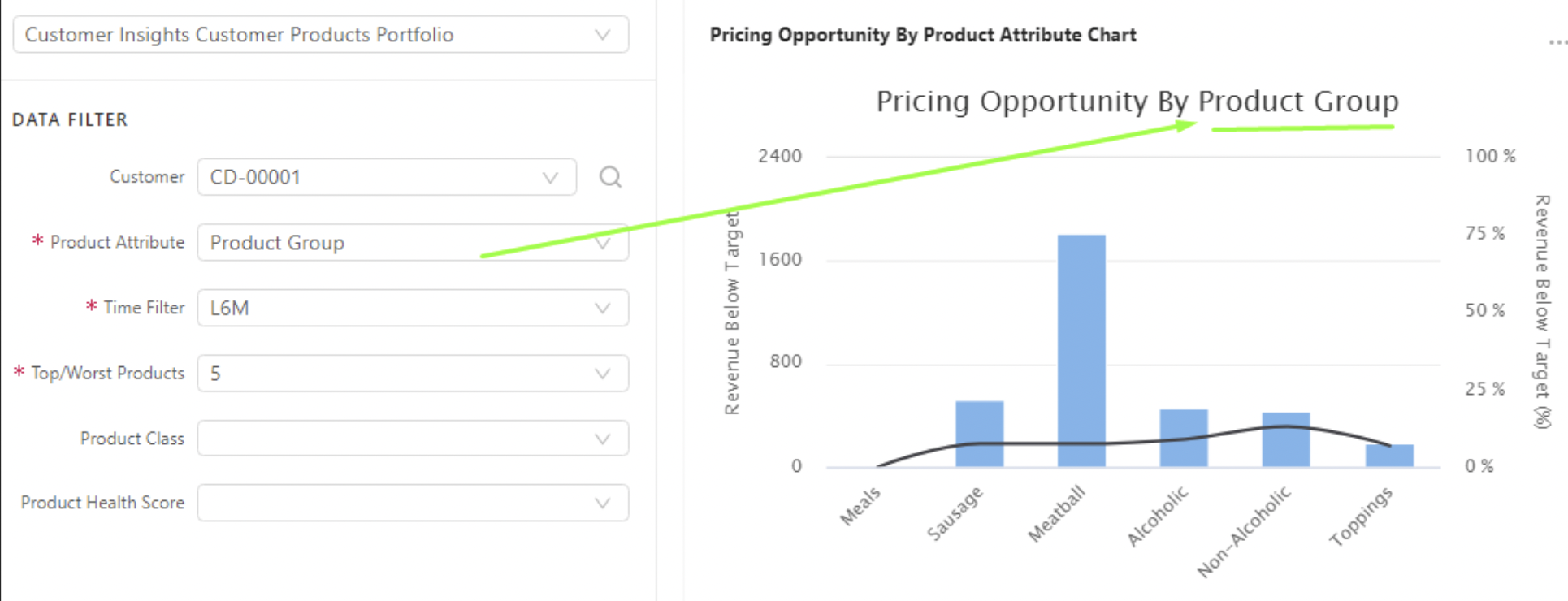
Pricing opportunity by product attribute
Sums revenue below target by the input value in the product attribute filter. The chart label reflects the input value in the product attribute filter.
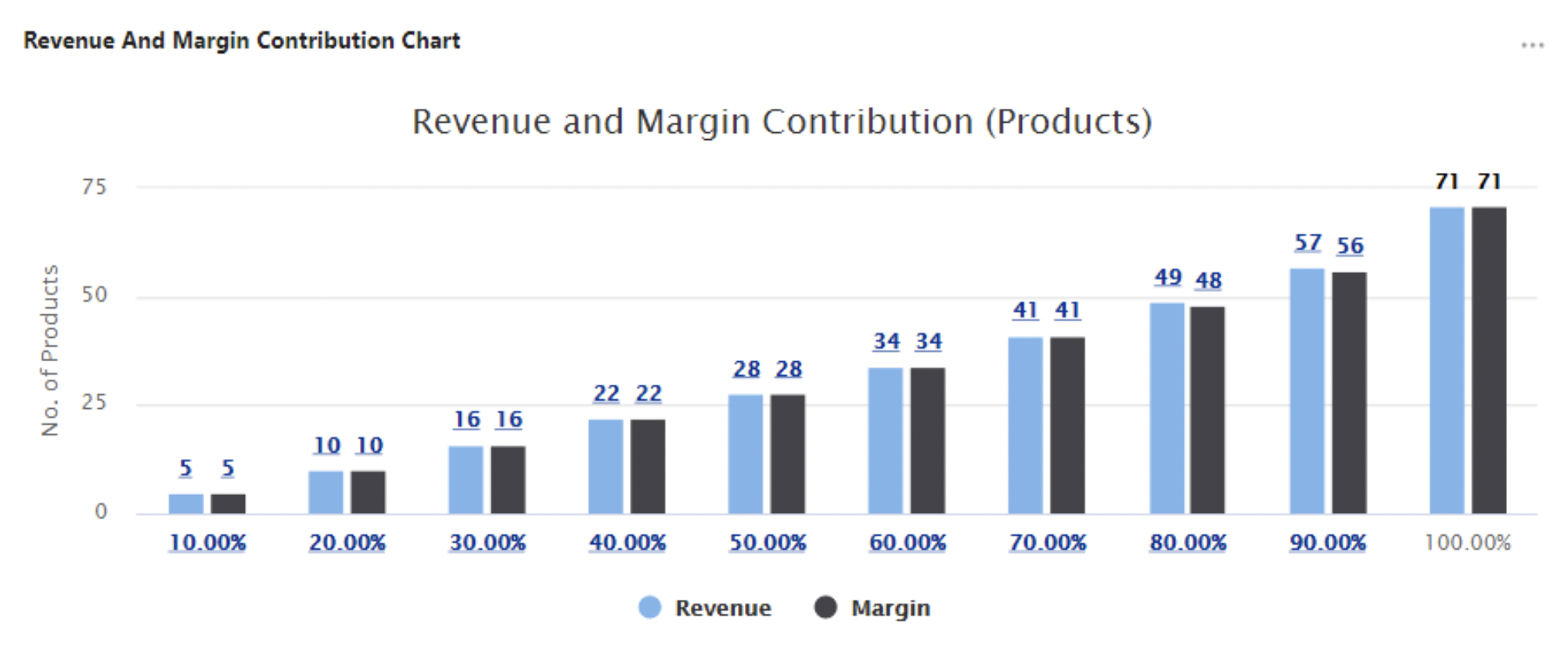
Revenue and Margin Contribution
Shows revenue and margin split into ten buckets to visualize the number of products needed to cover each bucket (cumulative contribution).
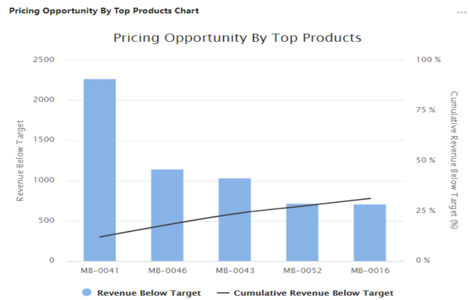
Pricing opportunity by top products
Shows products (bars) by revenue below target descending and cumulative revenue below target (line). They are grouped by product ID.
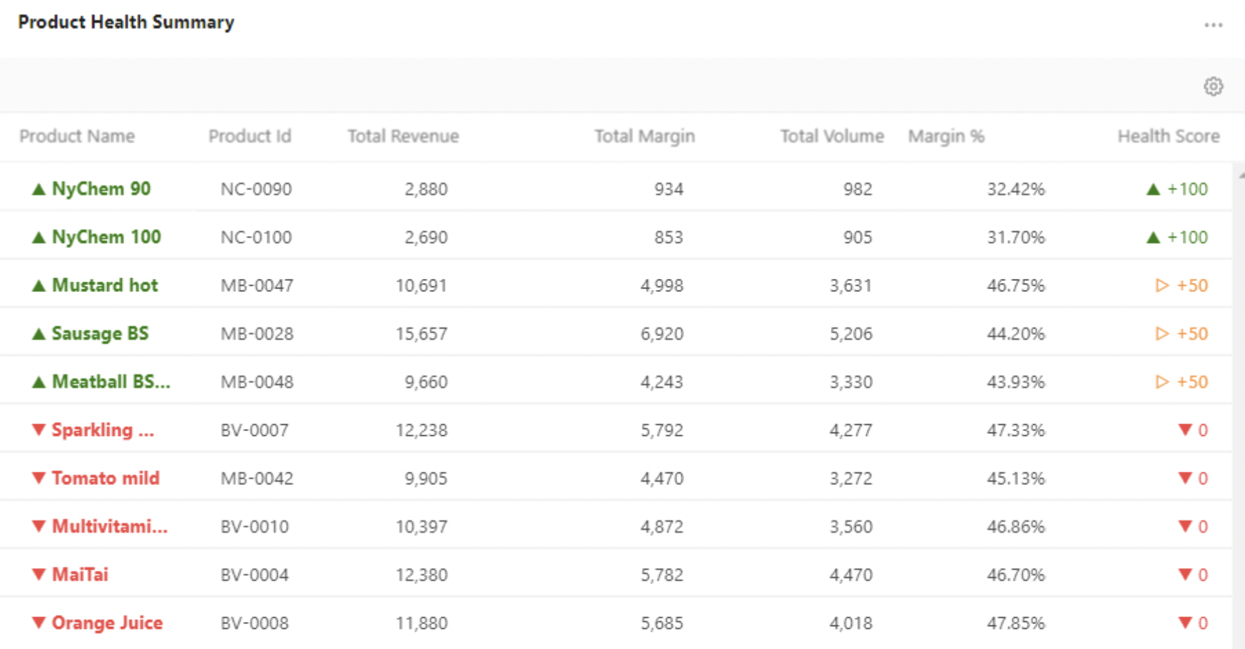
Product Health Summary
Shows revenue and margin for top/worst products.
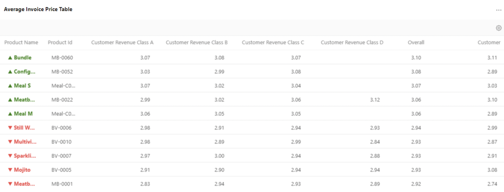
Average Invoice Price
Shows average unit price per product ID and customer classification by revenue.
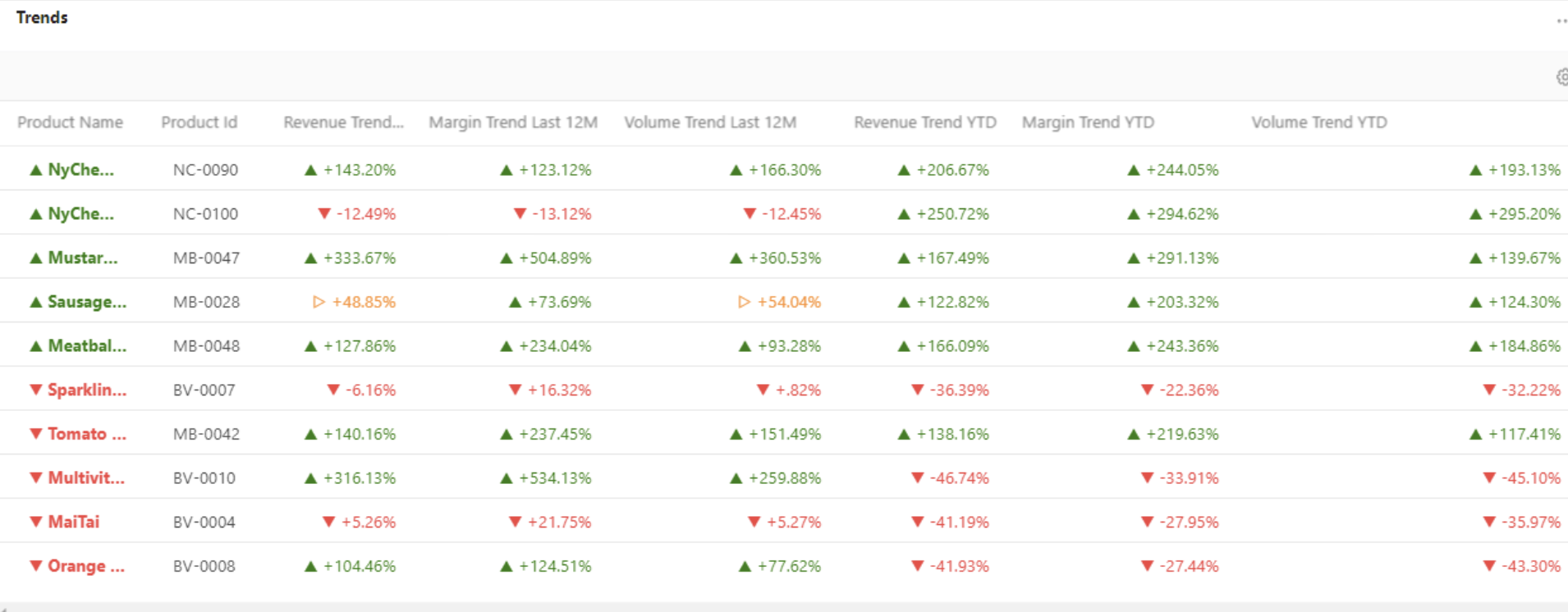
Trends
Show trend values for top/worst products (ranked by Health Score).
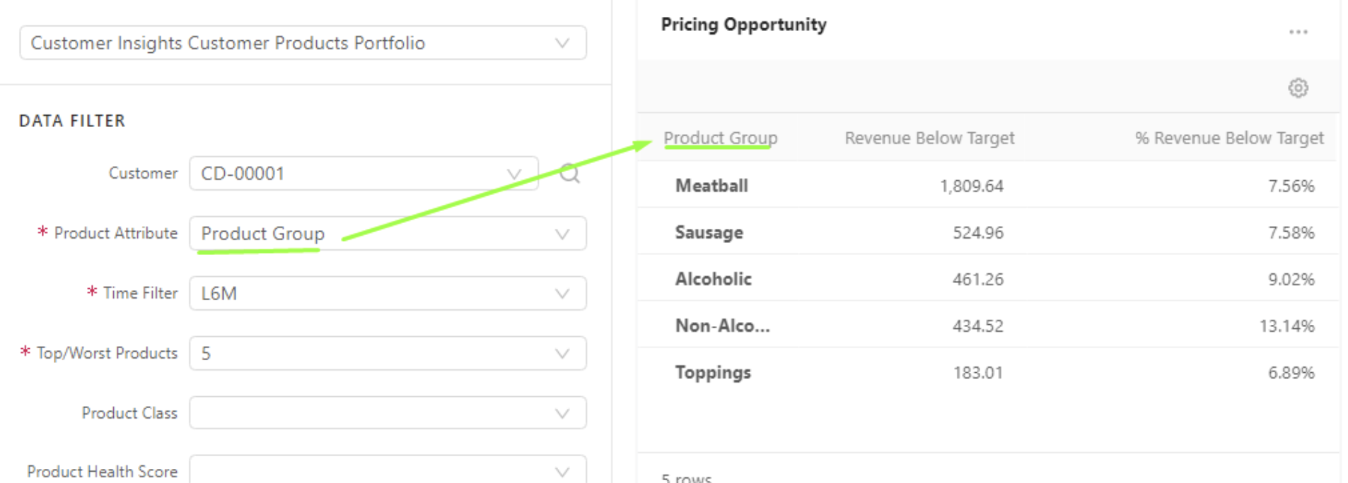
Pricing Opportunity
Shows revenue below target value and % revenue below target. They are grouped by the input value in the product attribute filter.
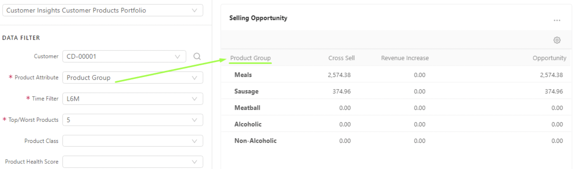
Selling Opportunity
Shows the total value which can be gained for products that the customer already bought and not bought in the given period. They are grouped by the input value in the product attribute filter.
2. Implementation Approach and Effort Estimation
Implementation Approach
This solution is based on an accelerator, the deployment is simple and can be accomplished by ensuring all data is well defined and available in the partition before the package is installed. Being an extension of the Sales Insights Package its re-uses some of its components.
Configurable aspects of the accelerator are
-
Customer Segmentation definition – You can define grouping of customers by common characteristics/dimensions. Then selected KPIs of individual customers are calculated according to the values aggregated on the Customer Segment level.
-
Source of data – Defines from which source (Datamart / Data Source) your transactional data comes from and which fields should be used for calculations.
-
Parameters, which drive:
-
Calculations of KPIs – You can set class values and thresholds for various product and customer classifications.
-
Displaying of certain things – You can change lists of options for filters, and default presets for dashboard filters.
-
Waterfall chart configuration (it uses the configuration defined for the Sales Insights accelerator installed on the same partition)
The installation follows an intuitive process during which the user is guided to -
-
Ensure the data is available in the datamart prior to attempting the installation of the package
-
Set up the datamart mapping by selecting the appropriate fields for
-
Source Type
-
Datamart name
-
CustomerId
-
Customer Name
-
ProductId
-
Product Name
-
Pricing Date
-
Invoice Price
-
Margin
-
Quantity
-
UniqueId
-
Update the company parameters and advanced configuration options
-
PFXTemplate_CustomerInsights_Configuration
Most of the parameters used in the CI are saved in this table like
-
Category
-
Key Name
-
Value
-
Is Default
-
Order
-
Key Label
-
Note
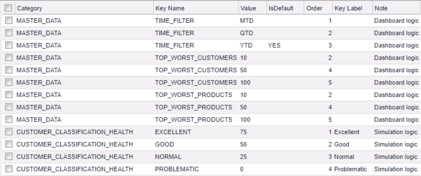
The settings here are used for the time filter selection input, top/worst customers selector input, top/worst products selector input, KPI selector input, Display of Trend Columns, Display of Health Score Columns, Revenue and Margin Contribution Chart, Number of next months, Customer Health Score, Customer Revenue Classification, Customer Health Score Classification, Product Quantity Classification, Commodity vs Specialty Product Classification and Inactive Customer Classification
The details of the attributes for each can be found here
-
PFXTemplate_CustomerInsights_Customer_Segment
This table is used to define the customer segmentation. Customer segments can be obtained from multi data source types such as: Data Source, Customer Master, Customer Extensions. You can define it in this table.
You can add more customer attributes to the table if they are not present yet. Set the value of the Is Active column to YES, if you want to add this attribute into the segmentation processing and exclude the field with isCustomerId = YES. The field set to Is Customer Id = “YES” will not join into the segment data, the system uses it as a key to find data.
-
CurrencySymbols
This is a Company Parameter of Sales Insights Package, and it should be deployed by this package. Customer Insights re-uses it to show the currency symbol in charts. If your currency is missing, you can add it to this table.
-
CI_QuoteType_Mapping
This table is used to define the Quote Type on each portlet of the dashboard. When a user selects multiple products and clicks the Create Quote button on a portlet, a new Quote with this Quote Type mapping will be created
Starting with the 1.6 version of this package, it is recommended to have 8 threads per partition where CI is deployed. If the number is lower, the DL calculations may fail.
Ensure the calculation flows are deployed and run. To keep the aggregated data (CI_AggregatedData Data Source) synchronized with customer classification data (CI_CustomerClassification Data Source), a scheduled job needs to be set to run the Data Load CI_CustomerClassification first and then run CI_AggregatedData Data Load (Distributed Calculation).
Note: If this package is deployed to a partition where it was installed before, it is recommended to delete the previously created objects of simulation (Analytics > Simulation: CustomerInsights) and company parameters (Company Parameters > CustomerInsights : All)
Customizations
The accelerators are built to work in different scenarios addressing different customer requirements. However, there are certain instances where the customer requirements might need subtle extensions or major changes.
The extensions/customizations are made through groovy code and the more custom work is done, the less consistency the solution may have with Pricefx and the Accelerators core features and intentions.
Excessive customization can lead to incompatibility issues or performance concerns and every effort should be made by both the implementation team and that customer to find solutions that merge specific user processes with Pricefx best practice for the ideal results.
The level of customization will be driven by customer’ needs and the data. This will define the level of detail these dashboards can visualize and aid in analysis. Also, in most dashboards, the filters can be customized based on the different data sources imported into the partitions.
The solution can be implemented by following the below steps:
-
Ensure access to the partition and the platform manager.
-
Ensure all prerequisite data is available in the partition
-
Follow the steps in the solution design section to deploy the accelerator
Estimate
The implementation is expected to take 1 sprint using 50% of a Configuration Engineer’s time. This estimate represents the full time to implement; not just the installation but also the preparation time, ramping up users to use it, and, overall, making it an effective tool for the customer.